![]()


How a Travel Vlogger Uses Filmora Colour Grading to Make Every Destination Look Cinematic
Let me tell you about a video that made twenty thousand people want to go to Meghalaya.
Nandini Rao had been travel vlogging for about eighteen months when she uploaded the video that changed the trajectory of her channel. She had visited Meghalaya during the monsoon — a bold travel choice that most people would consider a logistical challenge, given the rain. And it did rain. It rained almost continuously for the five days she was there.
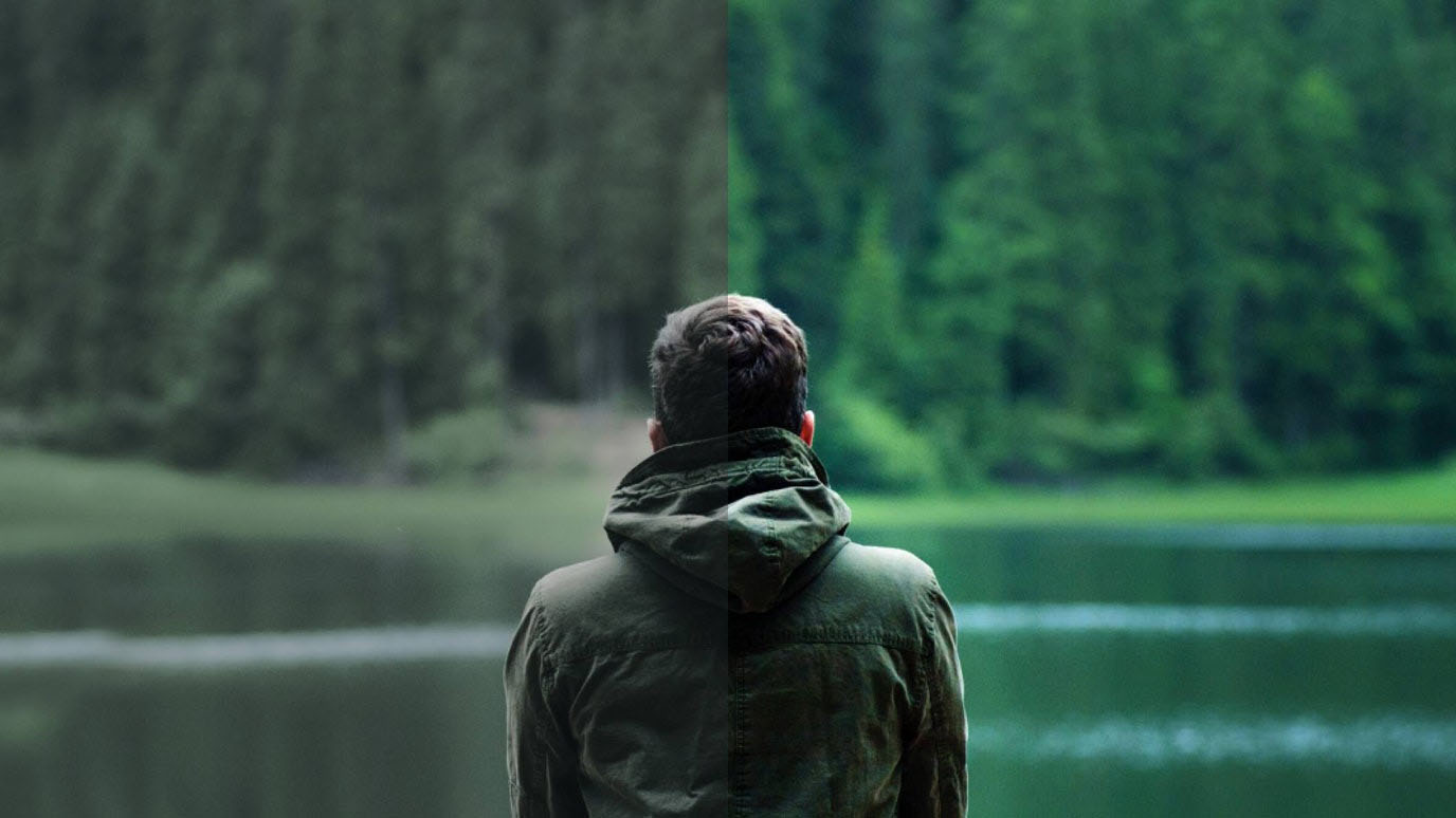
Her raw footage, when she reviewed it back at her hotel on the last evening, was underwhelming in the way that raw footage almost always is. The colours were flat. The sky was a uniform grey. The forests looked dark and slightly muddy. The famous living root bridges — those extraordinary structures where the roots of rubber fig trees have been trained over generations to form actual walking bridges across streams — looked merely interesting in the raw footage rather than mythically beautiful.
The footage was technically competent. It was accurately exposed. It captured what was there. But it did not capture how it felt to be there.
This gap — between what the camera records and what the human eye and nervous system experiences — is one of the fundamental challenges of filmmaking and photography. Our brains process the visual world with extraordinary sophistication, enhancing contrast, compensating for light, interpreting colour in context, and adding emotional weight to everything we see based on what we are feeling at the moment of seeing. The camera does none of this. It records photons hitting a sensor and converts them to data. The result is technically accurate and emotionally inert.
Colour grading is the process of bridging that gap. It is the practice of taking technically accurate footage and making it feel like what it was like to be there — or, when the creative vision requires it, making it feel like something even more heightened, more cinematic, more emotionally concentrated than reality.
Nandini spent two full days in Filmora’s colour grading workspace before the Meghalaya video was finished. When she uploaded it, the comments section filled immediately with people saying they had never wanted to visit Meghalaya before watching this video and now it was the top of their bucket list. The video accumulated sixty thousand views in its first month. Her subscriber count jumped by four thousand.
The destination had not changed. The footage had not changed. The colour grading had changed everything.
This is her story — and it is a complete, practical guide to how colour grading works, what Filmora’s tools allow you to do with it, and how to develop the eye and the workflow that produces footage that looks genuinely cinematic.
What Colour Grading Actually Is — The Distinction That Matters

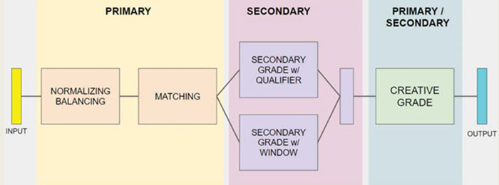
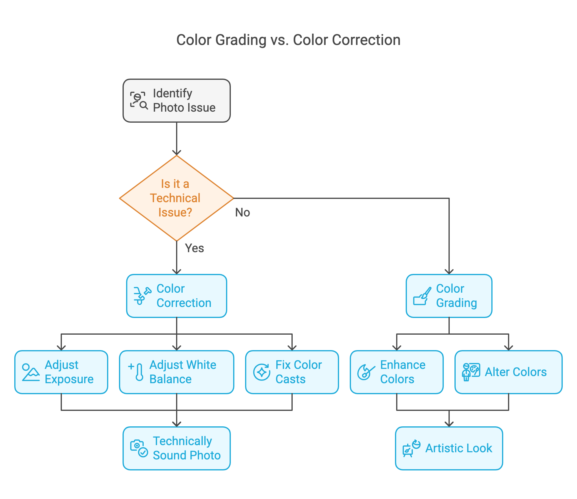
Most people who are new to video editing use the terms colour correction and colour grading interchangeably. They are not the same thing, and understanding the difference is the foundation of understanding colour work.
Colour correction is the technical process of making footage look as it actually appeared to the human eye — fixing problems introduced by the camera, the lighting conditions, or the settings. If footage is too warm because of incandescent interior lights, colour correction brings it back to neutral. If footage is underexposed, colour correction brings up the brightness. If there is a green cast because filming happened under fluorescent lights, colour correction removes it.
Colour correction asks: what should this footage look like if it were technically perfect?
Colour grading is the creative process that happens after colour correction. It asks a completely different question: what should this footage feel like?
Colour grading introduces deliberate creative choices — choices that may deviate significantly from technical accuracy — in service of emotional intention. Making shadows cooler and highlights warmer to create a sense of golden nostalgia. Crushing the blacks and boosting contrast to create a moody, cinematic look. Pushing the teal and orange colour split that has become the signature aesthetic of Hollywood action films. Desaturating everything except one key colour to direct the viewer’s emotional attention.
These are not corrections. They are interpretations. And the interpretations that great colour graders make are not arbitrary — they are responses to the emotional content of the footage and the emotional experience the video is intended to produce.
Nandini describes the difference this way: “Colour correction makes my footage look like Meghalaya. Colour grading makes it look like how Meghalaya felt.”
Understanding the Colour Wheel — The Foundation of All Colour Work
Before getting into Filmora’s specific tools, it helps to have a clear mental model of how colour works — because all colour grading tools, regardless of the software, are based on the same underlying principles.
The colour wheel organises colours in a circle based on their relationships to each other. Opposite colours on the wheel are called complementary colours — they create maximum visual contrast when placed together. Adjacent colours are called analogous — they create harmony and unity.
The most important colour grading principle to understand is the shadow-highlight relationship. In most professional colour grades, shadows and highlights are pushed in complementary directions on the colour wheel. If highlights are pushed toward warm orange, shadows are pushed toward cool blue-green — the teal-orange look. If highlights are pushed toward cool blue, shadows are pushed toward warm amber. This complementary relationship between the darkest and lightest parts of the image creates a visual richness and depth that flat, uniform colour cannot produce.
Understanding this principle explains why a great colour grade feels visually satisfying without the viewer being able to articulate why. The eye moves naturally between the warm and cool areas of the frame, experiencing the contrast as dimensionality and depth. The frame feels three-dimensional in a way that a flat colour grade does not.
The colour wheel is also the foundation of white balance — the adjustment that determines the overall warmth or coolness of the footage. A warmer white balance (higher on the orange-yellow axis of the wheel) makes footage feel sunny, intimate, and emotionally warm. A cooler white balance (higher on the blue axis) makes footage feel expansive, melancholic, or technically precise depending on context.
In Filmora’s colour grading workspace, the colour wheel appears in multiple tools — most prominently in the Curves and the Colour Wheels themselves — and understanding the underlying principle makes navigating these tools dramatically more intuitive.
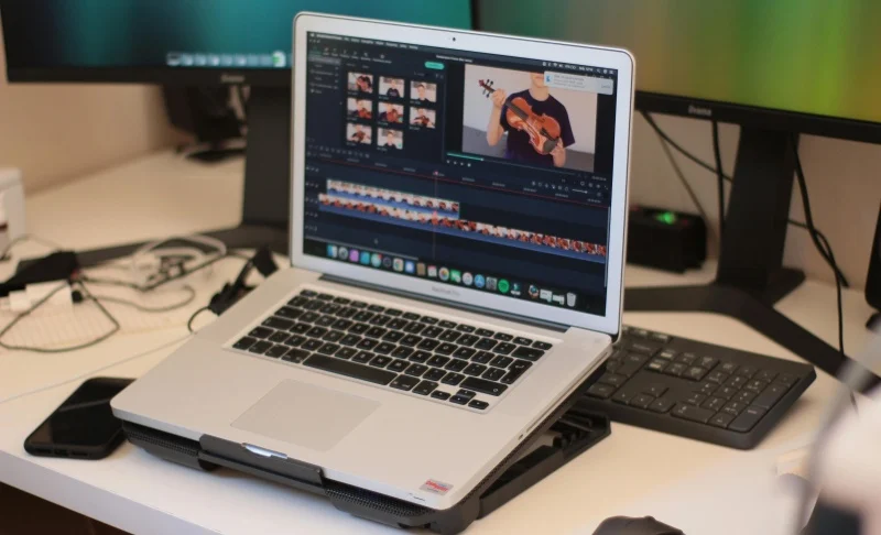
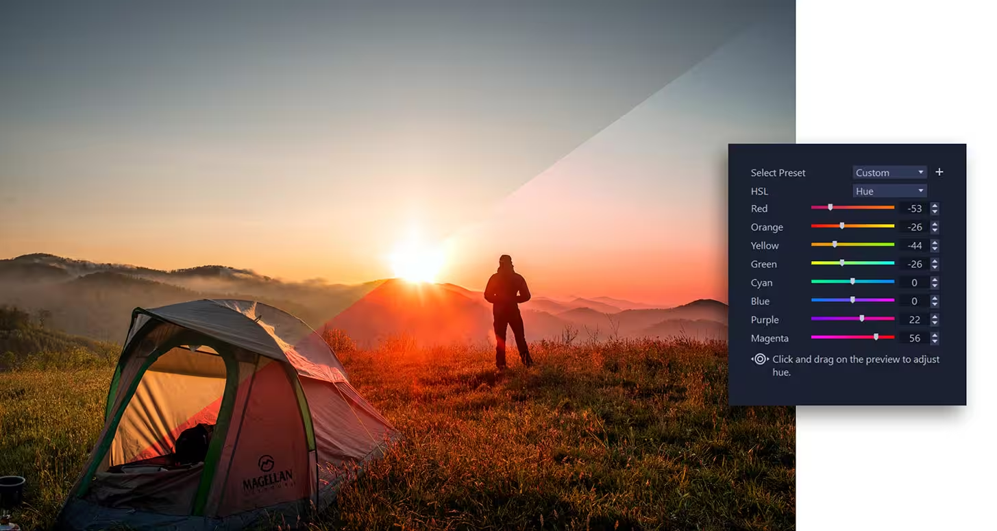
Filmora’s Colour Grading Workspace — A Complete Overview
Filmora’s colour grading tools are housed in the Video Colour section of the effects panel, accessible by double-clicking any clip on the timeline and navigating to the Colour tab. What you find there is a comprehensive suite of tools that covers everything from basic correction to sophisticated cinematic grading.
The Basic Colour Panel
This is where colour correction begins. The Basic panel contains exposure, contrast, highlights, shadows, whites, blacks, saturation, and temperature controls. Each is a slider that adjusts a specific attribute of the image.
Exposure controls overall brightness — moving it up brightens the image, moving it down darkens it.
Contrast controls the separation between the brightest and darkest areas of the image — higher contrast produces a punchier, more dramatic image; lower contrast produces a flatter, more muted one.
Highlights and Shadows are selective brightness controls — Highlights adjusts only the bright areas of the image without significantly affecting the shadows, and Shadows does the reverse. This allows you to independently control the upper and lower ends of the exposure range.
Whites and Blacks are similar but more extreme — they control the absolute brightest and darkest points in the image, used primarily to set the clipping points (the point at which bright areas become pure white or dark areas become pure black).
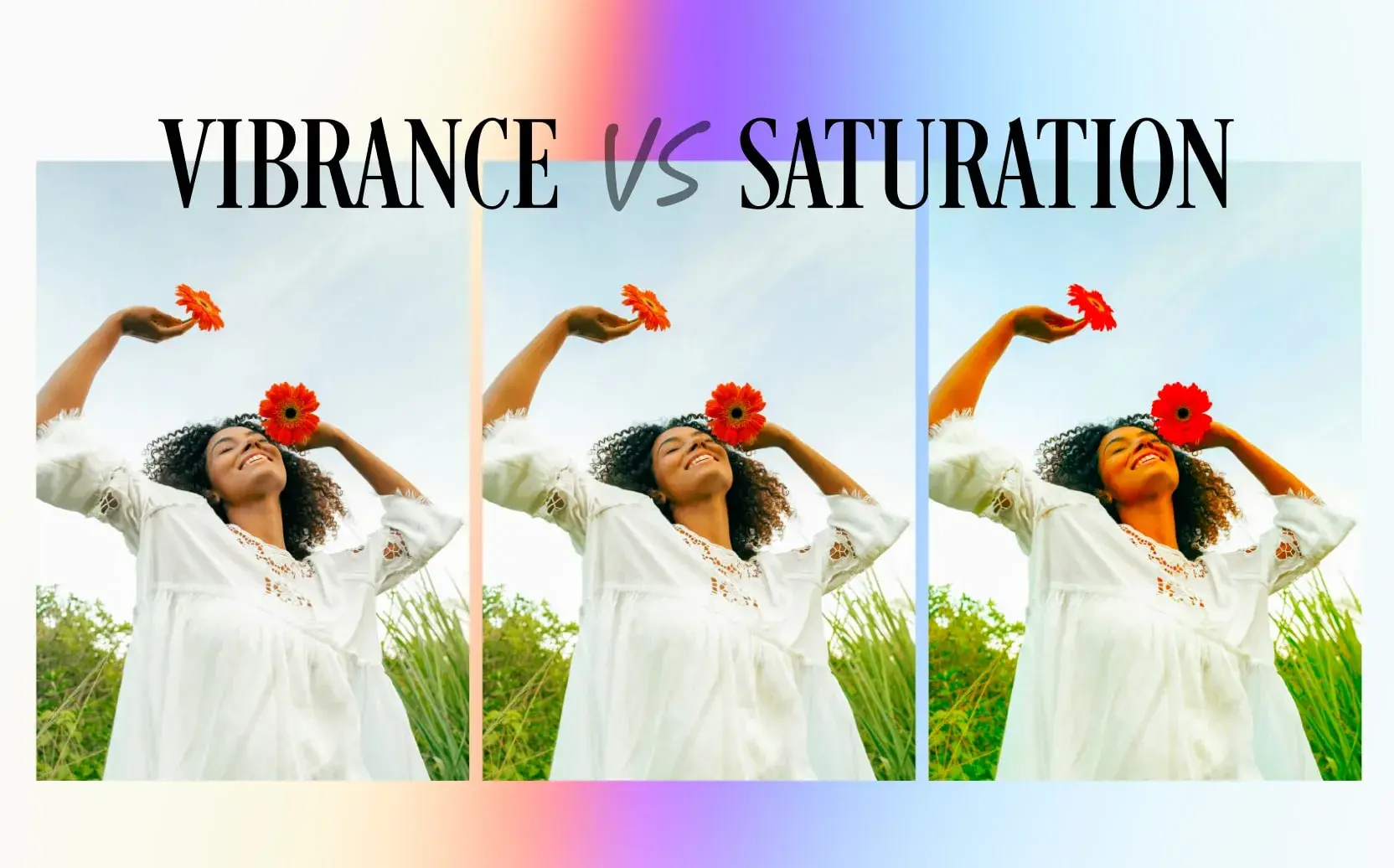
Saturation controls the overall intensity of all colours in the image. Vibrancy, a related control, boosts saturation selectively — affecting less-saturated colours more strongly than already-saturated ones, which often produces a more natural-looking result than raw saturation.
Temperature controls the warmth or coolness of the overall image — moving it toward orange/amber warms the image, moving toward blue cools it.
Tint is similar but operates on the green-magenta axis rather than the blue-orange axis — used primarily to correct the green cast of fluorescent lighting or the magenta cast that some artificial lights produce.
The Curves Tool
The Curves tool is where more precise and sophisticated colour work happens. It displays the image as a histogram — a graph showing how many pixels exist at each brightness level — and allows you to draw a curve that remaps each input brightness level to a different output brightness level.
An S-curve — where the curve is pulled up in the highlights and down in the shadows — increases contrast in a way that feels natural and filmic rather than the blunt increase that the Contrast slider produces.
The Curves tool in Filmora also allows independent curves for each colour channel — Red, Green, and Blue — which is where colour grading in the technical sense begins. Pulling the Blue curve down in the shadows adds orange/amber to the dark areas of the image. Pulling the Red curve up in the highlights adds warmth to the bright areas. These channel-specific adjustments are how the sophisticated colour relationships between shadows and highlights are created.
The Colour Wheels
Filmora’s Colour Wheels provide the most direct control over the shadow-midtone-highlight colour relationship. Three circular wheels control colour shifts independently in the shadows, midtones, and highlights.
The centre of each wheel is neutral — no colour shift. Moving the control point toward any edge of the wheel pushes that tonal range toward that colour. Moving the shadows wheel toward teal and the highlights wheel toward orange creates the teal-orange grade. Moving the shadows wheel toward blue and the highlights toward amber creates a warm-cool tension.
The outer ring of each wheel controls luminance — the overall brightness of that tonal range independent of colour. This is equivalent to what the Highlights and Shadows sliders do in the Basic panel, but with more precise control.
HSL Controls
HSL stands for Hue, Saturation, and Luminance. The HSL panel in Filmora allows you to adjust these three attributes for each colour in the spectrum — red, orange, yellow, green, teal, blue, purple, and pink — independently.
This is where you can, for example, make the greens in a forest footage more vibrant without affecting any other colour. Or desaturate the oranges to remove the slightly unnatural orange cast that sunsets sometimes develop in camera. Or shift the hues of specific colours — making the teal of water slightly more blue, or the yellow of sunlight more golden.
For travel filmmakers like Nandini, the HSL panel is particularly valuable because travel footage typically contains a wide range of colours from natural environments — and each environment has its own palette that benefits from specific treatment.
LUTs — Look Up Tables
LUTs are pre-built colour transformations — essentially colour grade presets that can be applied with a single click. A LUT takes the colour values of each pixel in the original image and remaps them according to a mathematically defined transformation, producing a specific look.
Filmora comes with a built-in library of LUTs ranging from cinematic film emulations to stylised looks designed for specific genres — urban, natural, moody, vintage. Third-party LUT packs are also available for purchase and import, allowing creators to use the exact colour grades developed for specific film productions.
LUTs are powerful and efficient but require understanding. A LUT developed for footage with a specific colour profile (typically log or flat footage with extended dynamic range) may look incorrect when applied to standard footage. Using LUTs effectively requires knowing what kind of footage the LUT was designed for and ensuring your footage is prepared accordingly.
Nandini uses LUTs as a starting point — she applies a LUT that roughly establishes the feel she wants, then refines using the Curves and Colour Wheels to push it in her specific direction.
Nandini’s Colour Grading Philosophy — The Thinking Behind the Craft
Before we walk through Nandini’s specific Meghalaya workflow, it is worth understanding the thinking she brings to colour grading — because the technical tools are only as useful as the aesthetic and emotional intelligence directing them.
“I think about colour grading as answering three questions,” she explains. “What did the light actually look like? What did the place feel like emotionally? And what do I want the viewer to feel when they watch this?”
These three questions are not always aligned — and when they are not aligned, the creative choices are about which to prioritise.
The actual light of Meghalaya in the monsoon was grey, diffuse, and low-contrast. If Nandini had graded purely to represent the actual light accurately, the footage would have looked exactly as flat and grey as the raw footage did. Technically truthful. Emotionally inert.
The emotional feel of Meghalaya in the monsoon — at least as Nandini experienced it — was lush, mysterious, ancient, slightly otherworldly. The constant rain had given everything a quality of intensified green and deep shadow. The living root bridges emerging from the mist felt like something from a different era of the world.
The viewer experience she wanted to create was wonder — the specific quality of wonder that makes a person think: I did not know this place existed and now I need to go there.
These three answers pointed toward a colour grade that was not accurate to the actual grey light of monsoon Meghalaya, but that was faithful to the emotional truth of being there and that served the intended viewer experience. Deeper greens. More contrast than the flat natural light provided. Cooler shadows to suggest mystery and depth. Slightly desaturated highlights to prevent the sky from fighting for attention with the forest.
This is the thinking that precedes the technical work. The tools are in service of a vision. The vision is arrived at through asking what the video needs emotionally, not what the footage technically contains.
The Meghalaya Workflow — Step by Step
Here is the complete colour grading workflow Nandini used for the Meghalaya video, reconstructed from her description and adapted as a practical guide.
Step One: Evaluate the raw footage in Filmora’s scopes
Before touching any sliders, Nandini watches each clip and evaluates it using Filmora’s video scopes — the waveform monitor and the histogram. These technical tools show the distribution of brightness and colour in the footage in ways that the eye alone can miss.
The waveform monitor shows brightness on a vertical scale (0 at the bottom is pure black, 100 at the top is pure white) and displays it across the horizontal width of the frame. Well-exposed footage should typically have content distributed across the full brightness range without clipping at either extreme.
The histogram shows the same information as a graph — a mountain-shaped distribution ideally centred in the middle with gradual fall-offs to the extremes. Footage that is too dark pushes the mountain toward the left (shadows). Footage that is too bright pushes it toward the right (highlights). Clipping appears as a spike at either extreme.
Nandini’s Meghalaya footage, filmed in diffuse monsoon light, showed histograms clustered in the midtones without much representation at either extreme — the telltale signature of flat, low-contrast footage. This evaluation told her exactly what correction was needed before grading began: lift the contrast to spread the tonal range.
Step Two: Primary correction on the Basic panel
Using the Basic panel, Nandini set the fundamental exposure and contrast of each clip before touching any colour controls.
She brought down the Highlights slightly — preventing the sky from becoming completely featureless white. She lifted the Shadows very slightly — opening up the deep shadow areas of the forest without making them look artificially brightened. She increased the Contrast moderately — giving the footage the punch that the flat monsoon light had stripped from it.
She left the Temperature control at this stage — the footage had a slightly cool cast from the overcast conditions, and she would address the overall warmth through the Colour Wheels rather than the Temperature slider to have more nuanced control.
This primary correction stage took approximately fifteen to twenty minutes per clip — faster for clips that were well-exposed, longer for clips with significant exposure problems.
Step Three: Applying a base LUT as a starting point
With the correction established, Nandini applied a LUT from Filmora’s library as a creative starting point — specifically a cinematic LUT designed to emulate the look of natural-light documentary filmmaking. She reduced the LUT’s opacity to approximately forty percent rather than one hundred — using it as a flavouring rather than a complete transformation.
The LUT at forty percent gave the footage a directional push toward her intended look — slightly more contrast, a gentle warmth in the highlights, a subtle desaturation in the greens that paradoxically made them feel more lush because it removed the slightly unnatural oversaturation that cameras sometimes produce in green environments.
Step Four: Sculpting the shadow-highlight relationship with Colour Wheels
This was the step where the footage began to feel genuinely cinematic rather than merely corrected.
Using Filmora’s Colour Wheels, Nandini pushed the shadows wheel toward a cool blue-green — deepening the mystery of the forest shadows and creating a sense of depth and age in the darkest parts of the frame. She pushed the highlights wheel slightly toward warm gold — not strongly, because the monsoon sky did not have golden light, but enough to create a warmth in the brightest parts of the frame that contrasted beautifully with the cool shadows.
The result was a teal-green shadow and warm highlight relationship that was not literally accurate to the grey monsoon light but was emotionally accurate to the experience — the ancient, lush, mysterious quality she wanted to convey.
Step Five: HSL refinement of the key colours
The dominant colours in the Meghalaya footage were green — in multiple variations, from the bright lime of young leaves to the deep emerald of mature forest canopy — and the neutral tones of the stone bridges and pathways.
Using the HSL panel, Nandini made specific adjustments to each major colour group.
She shifted the hue of the greens very slightly — moving them away from the slightly yellow-green that cameras typically produce toward a richer, deeper emerald. She increased the saturation of the greens modestly — not aggressively, because over-saturated greens look artificial — just enough to give the forest the lush intensity it had in person.
She slightly desaturated the orange-amber range — reducing the presence of the muddy brown tones in the pathways and bridges that were a consequence of the wet stone and soil. This removal made the stone look more timeless and less like rain-dampened dirt.
She reduced the luminance (brightness) of the greens slightly — darkening the leaves to give the forest a more dramatic, dimensional quality.
Each of these adjustments was subtle — the kind of change that is invisible in isolation but that collectively transforms the visual character of the footage from flat documentation to cinematic presence.
Step Six: Adding contrast with an S-Curve
With the colour relationships established, Nandini returned to the Curves tool and drew a gentle S-curve — pulling the highlights up and the shadows down to increase contrast in a way that felt organic rather than mechanical.
The S-curve adjustment was particularly important for the interior footage — the shots inside the caves and under the forest canopy where the natural light was lowest. These shots needed significant contrast adjustment to feel present and dimensional rather than murky and flat.
She used the individual channel curves to make small additional colour refinements — pulling the blue channel very slightly up in the shadows to add a touch more of the cool quality she wanted, and pulling the red channel very gently down in the midtones to reduce any orange cast that the LUT had introduced.
Step Seven: Vignetting for compositional focus
A vignette — a subtle darkening of the frame edges — is one of the most powerful and most overlooked finishing tools in colour grading. It draws the eye naturally toward the centre of the frame, away from the edges, creating a sense of focus and intimacy that open, evenly bright frames do not have.
Nandini applied a gentle vignette in Filmora’s effects panel to most of the wide landscape shots. The vignette was set to a very low opacity — barely visible in isolation, but felt in its effect. It made the living root bridges, already visually extraordinary, feel like they were being presented — spotlit by the darkness at the edges of the frame.
Step Eight: Applying the grade across the timeline with LUT export
One of the practical challenges of colour grading a full video is maintaining consistency across clips filmed at different times of day, in different lighting conditions, with slightly different camera settings. Each clip that has been individually graded will look somewhat different, and while some variation is natural and desirable — the morning light should look different from the afternoon light — dramatic inconsistency breaks the visual coherence of the video.
Nandini uses Filmora’s copy-paste colour settings function to apply her primary grade to similarly-shot clips in batches — clips filmed in the same lighting conditions at roughly the same time receiving the same base correction. She then makes individual refinements to each clip within the batch.
For clips that are stylistically consistent, she also exports her custom grade as a LUT from Filmora and applies it as a starting point to the relevant clips — creating a consistent base that she then adjusts individually. This batch approach dramatically reduces the total time required to grade a full video while maintaining the individual attention that each clip genuinely needs.
The Visual Language of Different Destinations — How Grade Choices Reflect Place
One of the most interesting aspects of Nandini’s work is that she uses colour grading to create a distinct visual identity for each destination — so that footage from Meghalaya looks fundamentally different from footage from Rajasthan, which looks different from footage from Kerala, which looks different from footage from Ladakh.
This differentiation is not just aesthetic variety. It is visual storytelling — using colour to communicate the essential character of a place before any narration or explanation has occurred.
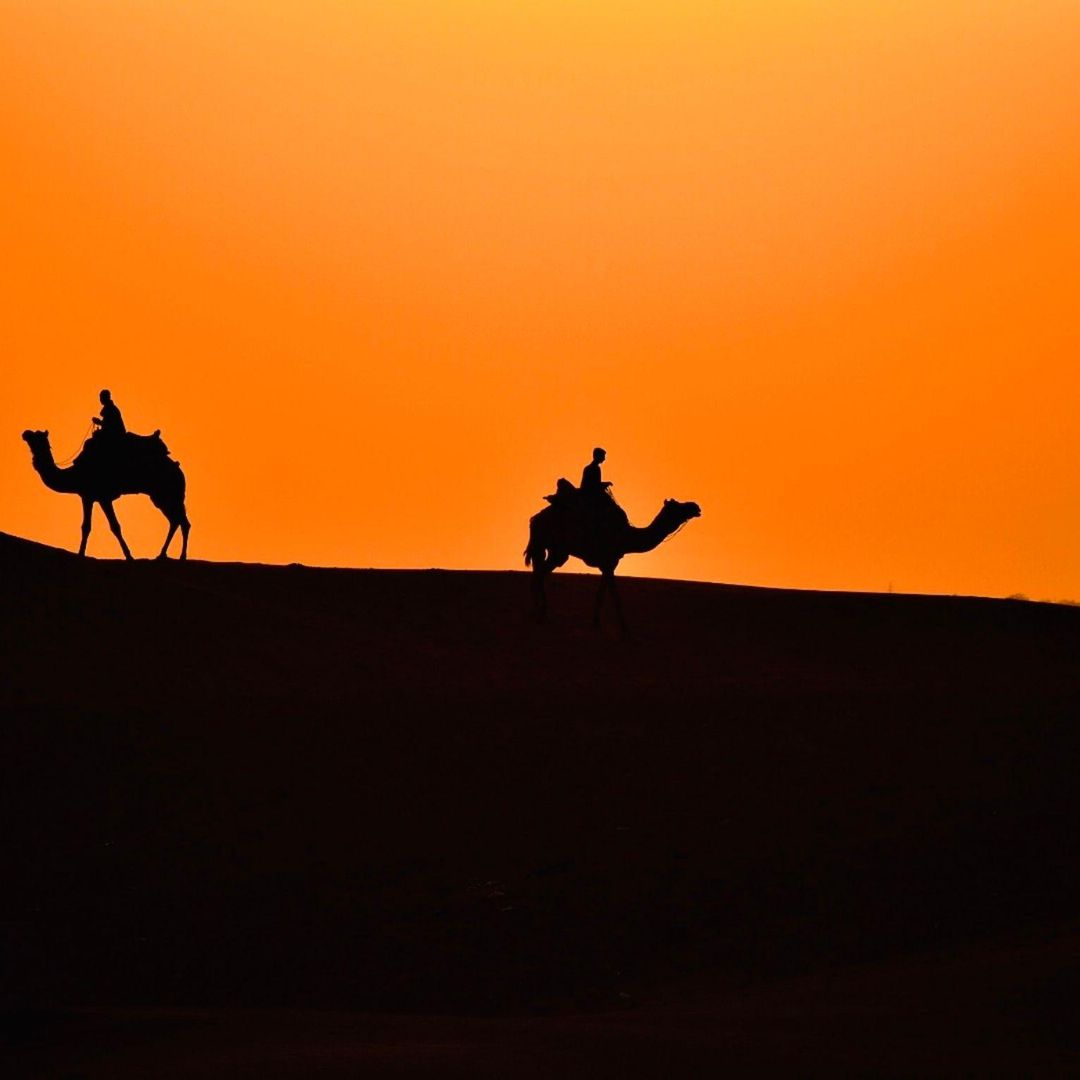
Rajasthan
For the desert heat, the ancient forts, the saffron and gold of textiles — Nandini uses a warm, high-contrast grade with strong orange-amber tones in the highlights and deep, warm shadows. The grade feels like heat. It feels like dust and age and the specific quality of afternoon light bouncing off sandstone. Cool tones are deliberately pushed out — the grade communicates that this is a warm place, a dry place, a place of fire and sun.
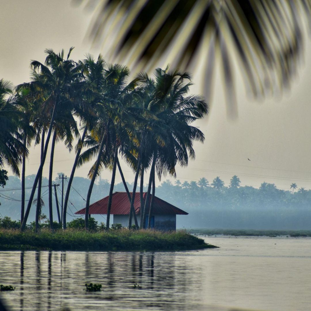
Kerala
For the backwaters, the coconut palms, the quiet of houseboat mornings — she uses a warm but gentle grade, lower contrast than Rajasthan, with rich greens that are allowed full saturation rather than the darker, more mysterious greens of the monsoon forest. The overall feel is luminous and peaceful — the quality of filtered light through palm fronds.
Ladakh
For the high altitude, the vast sky, the Buddhist monasteries on impossible cliffs — she uses a cool, high-contrast grade with deep blue shadows and crisp highlights. The grade communicates altitude and clarity — the specific quality of light above four thousand metres where the air is so thin that colours seem both more intense and somehow more austere than at sea level.
Meghalaya
As we have explored — deep emerald greens, cool mysterious shadows, restrained warm highlights, high contrast to cut through the flat monsoon light. The grade communicates ancient, lush, hidden.
Each of these grades is a visual argument about what the place is — an interpretation of character rather than a documentation of conditions. And viewers respond to these visual arguments even without consciously processing them. They watch a Rajasthan video and feel the heat. They watch a Ladakh video and feel the altitude. The colour is doing emotional work that narrative alone could not accomplish.
Common Colour Grading Mistakes — What to Avoid
Learning colour grading involves making specific predictable mistakes, and knowing what they are in advance prevents the most expensive ones.
Over-saturation
The most common beginner mistake. Pushing saturation too high makes colours look artificial — the greens become radioactive, the skin tones become orange, the sky becomes a shade of blue that does not exist in nature. The instinct to make colours more vivid is understandable but requires restraint. Subtle saturation increases look real. Aggressive ones look processed.
The test: if you can tell a video has been colour graded by looking at it, the grade is probably too heavy. Great colour grading is felt rather than seen.
Inconsistency between clips
Cutting between a warm-graded shot and a cool-graded shot without intentional reason creates a visual discontinuity that is distracting and undermines the coherence of the video. Each clip needs to be individually adjusted but the overall consistency of the grade must be maintained.
Ignoring skin tones
In videos that include people — vloggers on camera, portraits of locals, street scenes — skin tones are the most sensitive area of colour work. Human eyes are extraordinarily calibrated to detect incorrect skin tone, even if the viewer cannot articulate what is wrong. Over-cooled skin looks ill. Over-warmed skin looks sunburned. Over-saturated skin looks unreal.
When applying colour grades that might affect skin tone — warm grades, strong colour casts — check skin tones specifically. Use the HSL panel to adjust the orange and red channels (which are typically where skin tones sit in the colour spectrum) without affecting other colours.
Clipping highlights
Pushing highlights too bright until they become pure white — losing all detail in the brightest areas of the image. Once detail is lost to clipping, it cannot be recovered. Watch the waveform monitor and ensure highlights do not touch the top of the scale except in intentional, stylistic situations.
Making every destination look the same
The opposite of what Nandini does — applying the same grade to all footage regardless of destination, light, or intended emotional tone. Often happens when a creator discovers a LUT they love and applies it to everything. The result is footage that looks technically consistent but emotionally monotonous.
Developing Your Eye — The Practice That Underlies the Craft
Technical knowledge of colour grading tools is necessary but insufficient. The element that determines the quality of the grades a creator produces is the quality of their visual intelligence — their ability to look at footage and understand what it needs, and to look at a grade and know whether it is working.
This visual intelligence is developed through specific practices.
Study cinematography, not just tutorial videos
Tutorial videos teach you how to use tools. Great cinematography teaches you what to use the tools for. Watch films and documentaries with an analytical eye — specifically studying the colour choices. Notice how different films use colour to establish mood. Notice the difference in colour philosophy between a bright, naturalistic film and a heavily stylised one. Notice how different colour relationships in shadows and highlights feel different to you as a viewer.
The reference library you build by watching and analysing great visual work becomes the palette you draw from when making your own colour decisions.
Build a personal reference folder
Collect screenshots and video frame captures of colour grades you find beautiful, interesting, or appropriate for content similar to yours. When beginning a new project, look through your reference folder before opening Filmora. Having a visual target — a specific feeling you are moving toward — makes every technical decision more purposeful.
Nandini has a folder of several hundred reference frames organised by destination type, mood, and light quality. Before grading any new footage, she spends ten minutes reviewing the relevant section of this folder to calibrate her eye.
Grade the same footage multiple ways
Take a single clip of challenging footage — underexposed, or in difficult light, or with complex colour content — and grade it three completely different ways. Not three variations on the same grade, but three genuinely different interpretations. Warm versus cool. High contrast versus low contrast. Saturated versus desaturated.
This exercise builds the creative muscle of seeing multiple possibilities in the same footage and develops your understanding of how dramatically the same image can be transformed by different colour choices.
Watch your old grades six months later
One of the most instructive experiences in developing as a colourist is watching footage you graded six months ago. The grades that once seemed perfect often reveal their flaws with time and distance — the over-saturation you did not notice then is obvious now, the inconsistency between clips that felt fine in the moment now reads as sloppiness.
This temporal perspective is one of the most honest feedback mechanisms available and it costs nothing except patience.
The Moment the Footage Becomes Film
There is a specific moment in the colour grading process — a moment Nandini describes as the moment the footage becomes film — that experienced colourists will recognise immediately and that beginners are working toward.
It is the moment when you make an adjustment and the footage suddenly looks like something rather than just a recording of something. The frame acquires depth. The colours feel intentional rather than incidental. The image seems to have been made rather than captured.
This moment is real and it is reproducible — it is not luck or inspiration. It comes from the accumulation of a series of correct technical decisions that individually feel modest and collectively transform the image.
The Curves S-curve adds contrast that gives the image dimensionality. The Colour Wheels create a shadow-highlight relationship that makes the frame feel visually rich. The HSL adjustments bring each colour to its most expressive version without overcooking it. The vignette focuses the eye. The LUT provides the overall flavour that ties the individual adjustments into a coherent whole.
Each step is learnable. Each tool is accessible. The workflow can be followed by anyone willing to invest the time to understand it.
But understanding the tools is only the beginning. The craft is knowing what to do with them — knowing what the footage needs, knowing what the video is trying to feel, knowing when the grade is right.
That knowing is built from thousands of hours of watching great images, making imperfect grades, studying what went wrong, and returning to the timeline to try again.
Nandini spent two days grading the Meghalaya video. In those two days, she was not just making that video look the way she wanted. She was adding to the accumulated understanding of what she was capable of and what footage needs — adding to the knowledge that the next video would draw from, and the video after that.
The living root bridges had been growing for six hundred years before they became what they are. The viewer who watched Nandini’s video and felt the wonder of them had no awareness of those six hundred years. They just felt the wonder.
The craft that made the wonder visible was two days of colour grading in Filmora. And the years of developing the eye that made those two days possible.
Both invisible. Both essential.
Written by Digital Drolia — exploring the craft behind travel filmmaking and the tools that help creators show the world the way it actually feels. Found this valuable? Share it with a travel creator whose footage looks technically correct but does not yet feel like the places it shows.