![]()


How to Create a Signup Form for Your Website — The Complete Guide to Building Forms That Convert | Digital Drolia
There is a quiet moment that happens on thousands of websites every single day.
A visitor lands on your page. They read your content. They like what they see. They are genuinely interested in what you offer. And then — they leave. Not because they did not want to stay connected. Not because they were not interested enough. But simply because you never asked them to.
No signup form. No email capture. No invitation to stay in touch.
And just like that, a warm, interested, real human being who found their way to your website — possibly through a Google search, a social media post, a friend’s recommendation — disappears into the internet forever. You will never reach them again. You have no way to follow up, no way to nurture that interest into a relationship, and no way to convert that initial curiosity into a customer.
This happens millions of times every day across the internet. And it is entirely preventable.
A signup form is one of the simplest, most powerful tools on any website. It is the mechanism through which a casual visitor becomes a known contact — someone you can email, nurture, inform, and eventually convert into a loyal customer. It is the bridge between anonymous traffic and a real, growing audience that belongs to you.
Not to Instagram. Not to Google. Not to any algorithm that can change overnight and take your reach with it.
To you.
This guide is going to teach you everything about signup forms — what they are, why they matter so much, the psychology behind forms that convert, how to build them step by step, what tools to use, where to place them on your website, and how to optimize them over time for maximum results.
By the end, you will not just know how to create a signup form. You will understand how to create one that actually works.
Let us get started.
What Is a Signup Form and Why Does Every Website Need One?
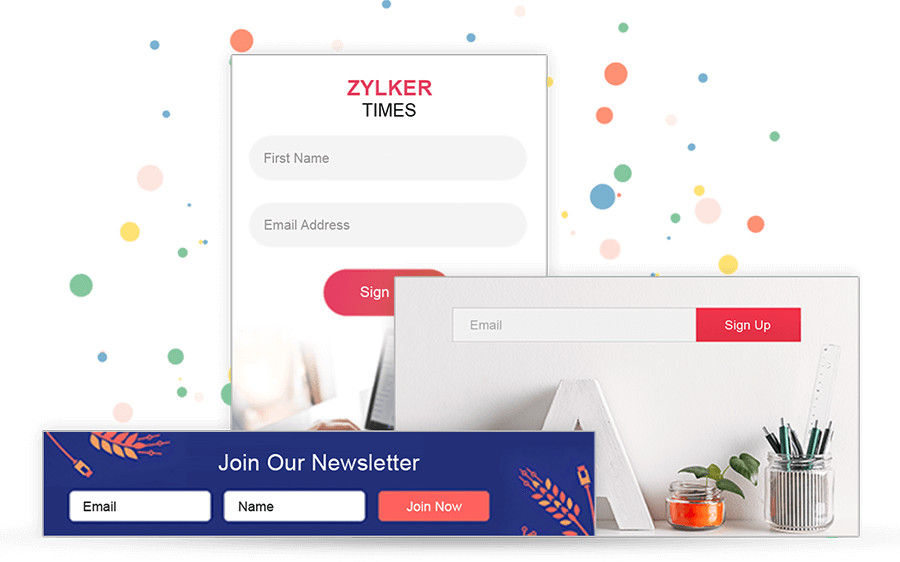
A signup form is a web form that invites visitors to submit their contact information — most commonly their email address, sometimes their name and other details — in exchange for something of value or simply to stay connected with your brand.
When a visitor fills in your signup form, they join your email list. And your email list is one of the most valuable assets your business can own.
Here is why that matters so much.
Your email list belongs to you. Your Instagram followers, your Facebook page likes, your Twitter audience — none of these belong to you. They belong to the platforms. If Instagram changes its algorithm tomorrow and your organic reach drops by 80% overnight — and it has happened, repeatedly, to businesses all over the world — there is nothing you can do about it. But your email list? Nobody can take that away. It is yours regardless of what any platform decides.
Email reaches people directly. When you send an email to your list, it lands in their personal inbox. Not in a crowded feed competing with hundreds of other posts. Not behind an algorithm deciding whether your content is worth showing. Directly in their inbox — the most personal digital space most people have.
Email converts better than almost any other channel. The average email marketing return on investment is consistently cited as one of the highest of any marketing channel — often quoted at around $36-42 return for every $1 spent. People who join your email list have explicitly expressed interest in hearing from you — which makes them significantly more likely to buy than a cold audience.
Your list grows in value over time. Every person who signs up is a long-term asset. Someone who joined your list two years ago and has been reading your emails consistently is far more likely to buy from you than someone who just discovered your website today. The longer your list grows and the longer you nurture it, the more valuable it becomes.
All of this starts with a signup form on your website. It is the entry point to everything that follows.
Understanding the Psychology of Signup Forms
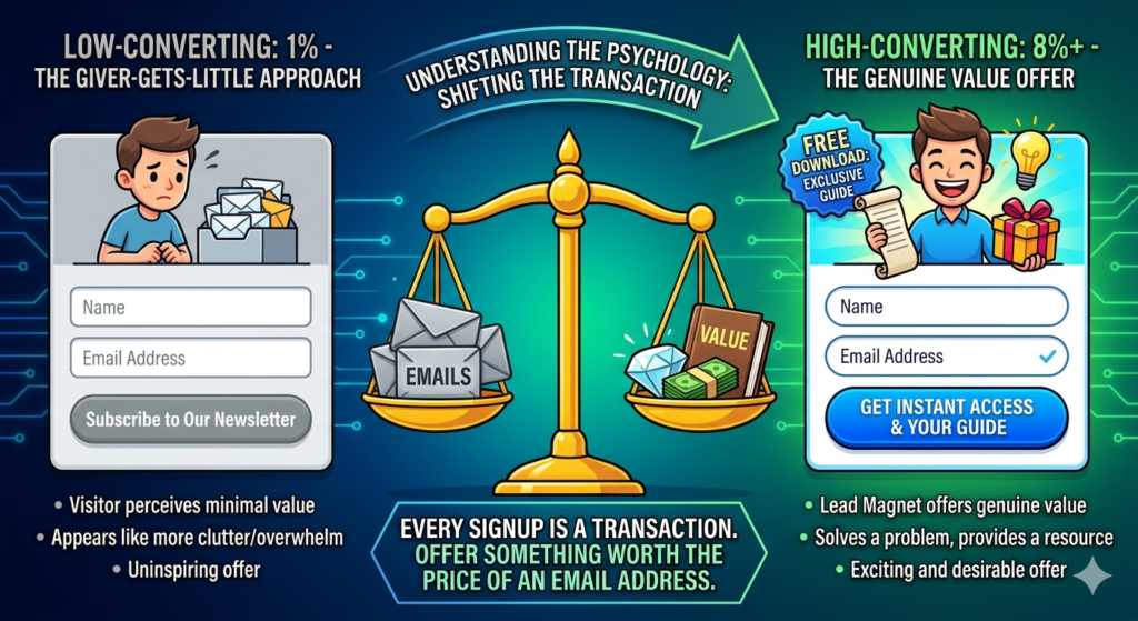
Before we talk about how to build a signup form, we need to talk about why people do or do not fill them in — because understanding this psychology is what separates a form that converts at 1% from one that converts at 8% or higher.
The Value Exchange Principle
Every signup form represents a transaction. The visitor gives you their email address — something personal and valuable, something that will invite you into their inbox regularly — and in return they expect to receive something worth that price.
Most businesses treat this transaction carelessly. They put a form on their website that says “Subscribe to our newsletter” and expect people to sign up. But think about it from the visitor’s perspective — why would they give you their email address to receive a newsletter? They already have too many emails. They are already overwhelmed with unread messages. “Newsletter” is one of the least compelling words in the English language.
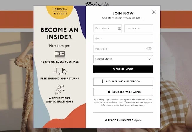
The businesses that build large, high-quality email lists understand the value exchange principle. They do not ask for an email address — they offer something genuinely valuable in exchange for it. A free resource. Exclusive content. Early access. A discount. A useful tool. Something the visitor actually wants and cannot easily get elsewhere.
This is called a lead magnet — the valuable item you offer in exchange for a signup. And it is one of the most important decisions you will make about your signup form.
The Friction Principle
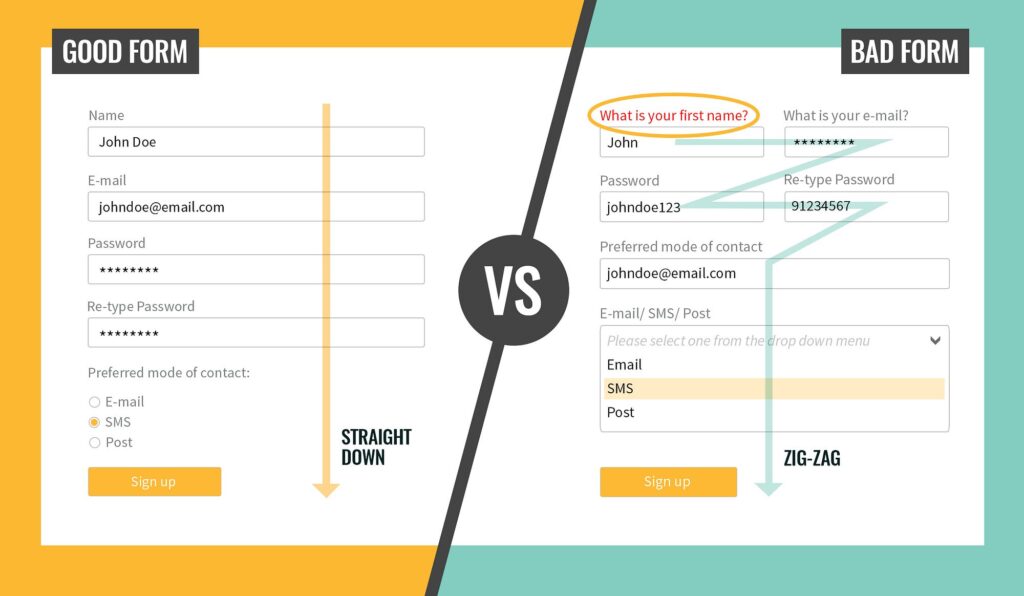
Friction is anything that makes it harder or more effortful for a visitor to complete your form. Every additional field you add creates friction. Every extra step in the process creates friction. A form that requires a name, email, phone number, company name, job title, country, and marketing preferences before someone can receive a free ebook has so much friction that most people will abandon it before completing it.
The rule of thumb: ask for as little information as possible to achieve your goal. For most email list signups, email address alone — or name and email — is sufficient. Resist the temptation to collect every piece of data you might someday find useful. You can always collect more information later, once you have built trust.
Every additional field you add will reduce your conversion rate. Sometimes that trade-off is worth it — if you genuinely need phone numbers to follow up with leads, for example. But be intentional about it, and always question whether you truly need each piece of information you are asking for.

The Trust Principle
Handing over an email address requires a degree of trust. Visitors wonder — will this person spam me? Will they sell my information? Will I regret giving this to them?
Your form needs to address these concerns, often before they are even consciously formed. A brief privacy note beneath your form — “We respect your privacy. Unsubscribe at any time.” — reduces anxiety significantly. A professional, well-designed form signals that you take this seriously. Clear, honest copy about what they will receive reassures them that they are not walking into a spam trap.
Trust is also built by everything around the form — the quality of your website, the credibility of your content, the social proof visible on the page (testimonials, follower counts, media features). The form itself is a relatively small part of the trust equation. The entire experience leading up to the form is what determines whether the visitor trusts you enough to submit.
The Timing and Context Principle
Where and when your form appears on your website dramatically affects whether visitors fill it in. A form that appears at exactly the right moment — when a visitor has just finished reading a piece of content that was relevant and valuable to them — will convert far better than the same form appearing the moment someone lands on your homepage.
Context matters enormously. A signup form on a blog post about Instagram marketing that offers a free social media calendar template is perfectly contextual — the visitor just read about social media marketing and is now offered a useful related resource. A generic “Subscribe to our newsletter” form on the same page is completely out of context and will convert at a fraction of the rate.
Understanding these four psychological principles — value exchange, friction, trust, and timing — gives you the foundation you need to make intelligent decisions about every aspect of your signup form design and placement.
Part One — Planning Your Signup Form
Step 1 — Define Your Goal
Before you build anything, get clear on what you want your signup form to accomplish. Different goals lead to different form designs, different placements, and different lead magnets.
Common goals for signup forms include building an email newsletter list for ongoing communication and content marketing, capturing leads for a specific product or service, offering a lead magnet to attract a targeted segment of your audience, providing access to a gated resource like a course, community, or tool, registering attendees for a webinar or event, and offering a discount or special offer to first-time visitors.
Your goal determines everything else. A form designed to capture leads for a high-ticket consulting service will ask different questions and appear in different contexts than a form designed to grow a general email newsletter list. Get clear on your goal before you touch any tool or template.

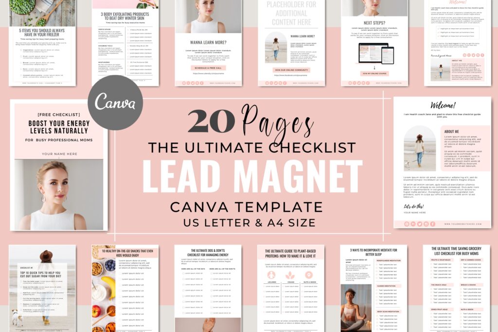
Step 2 — Choose Your Lead Magnet
This is the most important strategic decision you will make about your signup form — and it is entirely separate from the technical aspects of building the form.
Your lead magnet is the valuable item you offer in exchange for someone’s email address. It needs to be:
Genuinely valuable. Not something you threw together in twenty minutes, but something that genuinely helps your target audience with a real problem or goal.
Immediately accessible. Digital lead magnets work best — something that can be delivered automatically the moment someone signs up. PDFs, checklists, templates, mini-courses, video trainings, swipe files, toolkits, discount codes, free trials.
Highly relevant to your target audience. A lead magnet attracts a specific type of person. Make sure the people attracted by your lead magnet are the people you actually want on your list — not just anyone willing to download something free.
Specific and concrete. “A guide to getting more Instagram followers” is vague. “The exact 5-step Instagram bio formula that helped 200 businesses gain 1,000 followers in 30 days” is specific. Specific lead magnets convert far better than general ones.
Examples of powerful lead magnets by business type:
For a digital marketing consultant: “The 30-Day Social Media Calendar Template — Fill in the blanks and never run out of content ideas again.”
For a fitness coach: “The 7-Day Beginner Workout Plan — No gym required, 20 minutes a day, guaranteed to build the habit.”
For a restaurant: “Exclusive member offers and early access to new menu launches — join our VIP list.”
For an e-commerce store: “10% off your first order — sign up and get your discount code instantly.”
For a CA or financial advisor: “The Personal Finance Starter Checklist — 12 things every Indian professional should do with their money before age 35.”
For a photography studio: “The Wedding Day Timeline Template — used by 50+ couples to run a perfectly on-schedule wedding.”
Take time with this. A great lead magnet can transform your signup form’s conversion rate from 1-2% to 10-15% or higher. It is worth spending real creative energy on.
Step 3 — Decide What Information to Collect
Based on your goal and your lead magnet, decide exactly what fields your form will include.
For most email list building purposes, first name and email address is the sweet spot — personal enough to allow personalized emails using the subscriber’s name, but not so demanding that visitors abandon the form.
If you need to qualify leads more specifically — for example, if you only want to work with businesses above a certain size, or you need to know someone’s industry to send relevant content — you might add one or two qualifying questions. But be aware of every field you add increasing friction and reducing conversions.
Fields to consider beyond name and email — phone number (only if you will genuinely follow up by phone), company name (for B2B services), city or country (if you have location-specific offerings), and a single dropdown or checkbox question that helps segment your list immediately.
Fields you almost certainly do not need on a signup form — date of birth, full mailing address, detailed job title, and anything that feels like it belongs on a government form rather than a marketing opt-in.

Part Two — Choosing Your Signup Form Tool
There are several ways to create a signup form for your website, and the right choice depends on your technical comfort level, your existing email marketing platform, and your budget.
Option 1 — Your Email Marketing Platform’s Built-In Form Builder
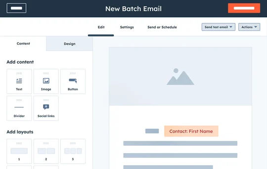
Most email marketing platforms — Mailchimp, ConvertKit, MailerLite, Brevo (formerly Sendinblue), ActiveCampaign, and others — include a built-in form builder that creates forms directly connected to your email list.
This is the most straightforward approach for most businesses. You build the form inside your email marketing platform, configure what happens when someone submits it (what email they receive, what list they are added to), and then embed the form on your website using a simple code snippet.
Mailchimp is the most widely used email marketing platform for small businesses and beginners. Its free plan supports up to 500 subscribers and 1,000 sends per month, and includes a basic form builder. The forms it creates are functional and reasonably customizable.
MailerLite is widely considered the best free option for beginners — its free plan is more generous than Mailchimp’s, its form builder is more flexible, and its overall interface is cleaner and easier to navigate. It supports up to 1,000 subscribers for free.
ConvertKit (now called Kit) is the preferred platform for content creators, bloggers, and online educators. Its form builder is excellent, and it has powerful automation features that make it easy to deliver lead magnets automatically and set up email sequences.
Brevo is a strong option for businesses that also want SMS marketing alongside email, and its free plan is quite generous — up to 300 emails per day with unlimited contacts.
For most businesses starting out, MailerLite or ConvertKit on a free plan is the recommended starting point.
Option 2 — Dedicated Form Builders
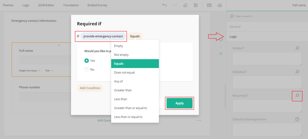
Tools like Typeform, JotForm, and Google Forms allow you to create more sophisticated forms with conditional logic, multi-step flows, and advanced question types. These are particularly useful for longer qualification forms, survey-style signups, or multi-step registration processes.
Typeform is known for its beautiful, conversational form design — questions appear one at a time in an engaging, app-like interface. Typeform forms consistently outperform traditional forms for longer or more complex signups because the one-question-at-a-time approach reduces the perceived effort of completing the form. The free plan allows up to 10 questions and 10 responses per month.
JotForm is the most feature-rich standalone form builder — it supports payment collection, file uploads, digital signatures, conditional logic, and hundreds of integrations. Its free plan allows up to 5 forms and 100 monthly submissions.
Google Forms is completely free and unlimited, but lacks the design flexibility and integration capabilities of dedicated marketing form builders. It is adequate for very basic data collection but not ideal for professional website signup forms.
Option 3 — WordPress Form Plugins
If your website runs on WordPress — which a large proportion of websites do — there are excellent form plugins that give you complete control over your form’s design and functionality.
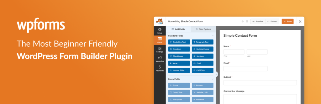
WPForms is the most popular form plugin for WordPress, with over 6 million active installations. Its beginner-friendly drag-and-drop builder requires no coding knowledge, and it integrates with all major email marketing platforms. The Lite version is free and includes basic form functionality.
Gravity Forms is the most powerful WordPress form plugin — it supports complex conditional logic, payment processing, user registration, and virtually any form configuration you can imagine. It is paid only, starting at around $59 per year, but for businesses that need advanced form capabilities on WordPress, it is the industry standard.
Elementor’s built-in form widget — if you build your WordPress site with Elementor (a popular page builder), its built-in form widget integrates directly with email platforms and gives you complete design control without needing a separate plugin.
Option 4 — Website Builder Native Forms
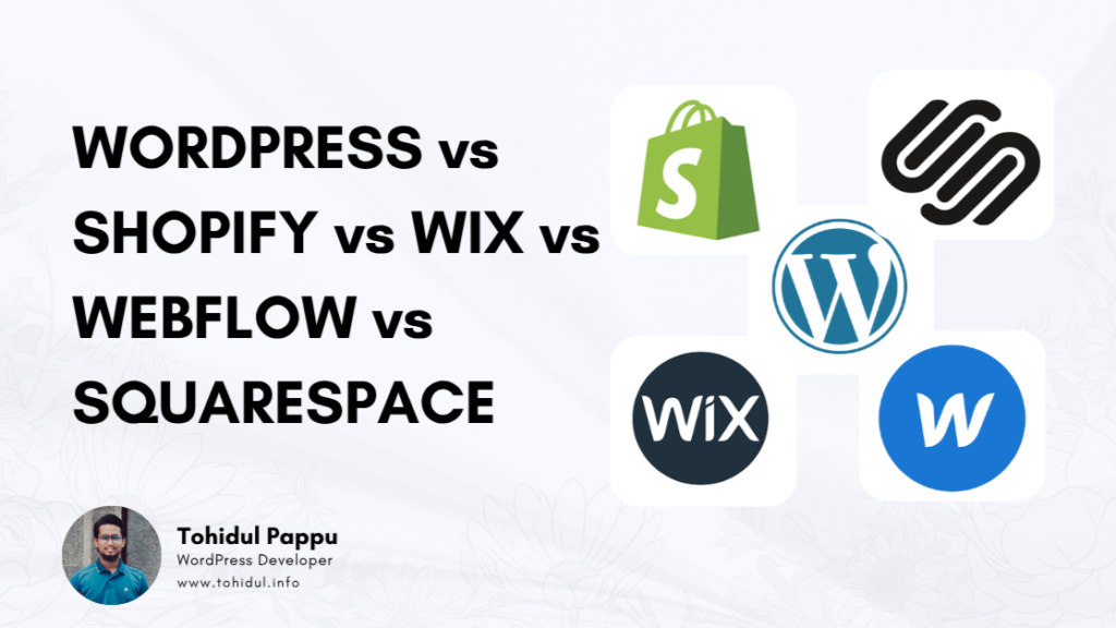
If your website is built on Squarespace, Wix, Webflow, Shopify, or another website builder platform, each has its own native form functionality.
Squarespace includes a Newsletter Block that integrates with Mailchimp and several other email platforms, as well as a Form Block for more complex data collection.
Wix has its own email marketing platform (Wix Email Marketing) with built-in signup forms, as well as a Form Builder app that connects to third-party platforms.
Shopify has excellent native email capture tools specifically designed for e-commerce — including popup forms, embedded forms, and abandoned cart capture — all available through Shopify Email and the Shopify App Store.
Webflow has a built-in Form element that is highly customizable and integrates with major email platforms through Zapier or direct connections.
Part Three — Building Your Signup Form Step by Step
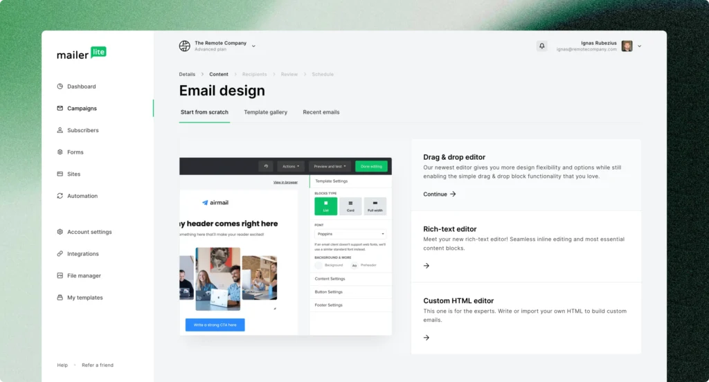
Let us walk through the process of building a signup form using MailerLite — one of the best free options available — as our example. The principles apply to any platform, but the specific steps will give you a clear practical reference.
Step 4 — Set Up Your Email Marketing Account
Go to mailerlite.com and create a free account. You will need to verify your email address and complete a brief onboarding process where you provide your business name, website URL, and some basic information about your list.
Once your account is set up, you will land on the MailerLite dashboard. Before you create any forms, spend a few minutes exploring the platform — particularly the Groups or Segments section (where your subscribers will be organized) and the Automations section (where you will set up the automatic delivery of your lead magnet).
Step 5 — Create Your Subscriber Group
In MailerLite, organize your subscribers into groups based on how they signed up or what they are interested in. Create a group for the signup form you are about to build — for example, “Website Signup — Social Media Calendar” or “Homepage Newsletter List.”
This organization is important because it lets you send targeted, relevant emails to specific segments of your list rather than emailing everyone the same thing regardless of their interests.
Step 6 — Set Up Your Lead Magnet Delivery Automation
Before you build the form, set up the automation that will automatically deliver your lead magnet to new subscribers. This ensures that the moment someone signs up, they instantly receive what you promised — no manual follow-up required.
In MailerLite, go to Automations and create a new automation. Set the trigger as “When a subscriber joins a group” — select the group you just created. Add an email action — this is the welcome email that will automatically send to new subscribers. In this email, include a download link or direct attachment for your lead magnet, a warm welcome message introducing yourself and what they can expect from you, and a brief note about how often you will email them.
Setting this up before the form goes live means your lead magnet delivery is completely automated from day one.
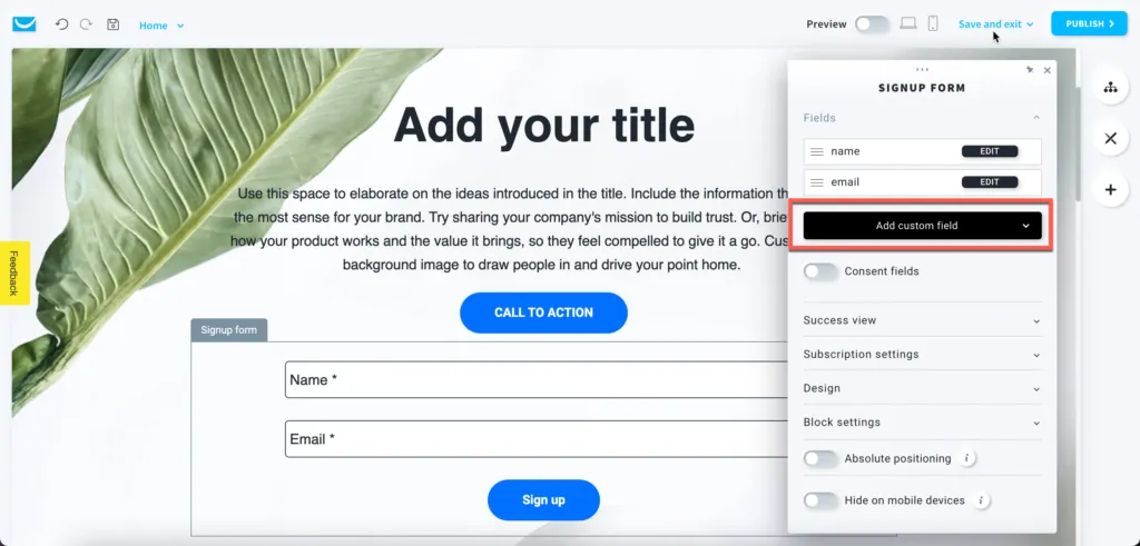
Step 7 — Build Your Form
In MailerLite, go to Forms and click Create New Form. You will have options for different form types — embedded forms (which sit within your page content), popup forms (which appear over the page), and landing pages (full-page signup experiences).
For your first form, choose Embedded Form — this is the most versatile type, suitable for placement throughout your website.
The form builder interface:
MailerLite’s form builder is drag-and-drop — you see a live preview of your form on the right and a settings panel on the left. You can add, remove, and rearrange fields, adjust styling, and configure settings.
Configure your fields:
Start with the fields you decided on in Step 3. For a standard email list signup, add a First Name field and an Email field. That is it. Resist the urge to add more.
Click on each field to configure its settings — label text (what appears above the field), placeholder text (the greyed-out hint text inside the field before the visitor types anything), and whether the field is required.
For your First Name field, the label might simply be “First Name” and the placeholder might be “Enter your first name.” For the Email field, “Email Address” with placeholder “Enter your email address.”
Design your submit button:
The submit button is one of the highest-impact elements of your form. Its text, color, and positioning all affect your conversion rate.
Button text: “Subscribe” is weak and generic. Instead, use action-oriented, benefit-focused text that reminds the visitor what they are getting. “Send Me the Template” is stronger. “Get My Free Calendar” is stronger still. “Yes, I Want the Checklist!” creates enthusiasm and clarity simultaneously. The best button text tells the visitor exactly what happens when they click — and frames it as something they want rather than something they are giving.
Button color: Your button should stand out from everything else on the form. If your form has a white background, a button in your brand’s accent color — whatever is most visually prominent — will draw the eye naturally. Avoid grey buttons, which look inactive and easy to overlook.
Styling your form:
In the design settings, choose colors, fonts, and spacing that align with your website’s visual identity. Your form should look like it belongs on your website — not like a generic form that was dropped in from a different world.
Add a headline above the form fields. The headline should communicate the primary benefit of signing up. Not “Subscribe to Our Newsletter” — but something like “Get Your Free 30-Day Content Calendar” or “Join 2,400 Business Owners Getting Weekly Marketing Tips” or “Get Instant Access to Our Free Website Audit Checklist.”
Optionally add a brief subheadline that provides supporting context — “Delivered instantly to your inbox. No spam, ever.”
Add a privacy note: Below your submit button, add a brief line of small text: “We respect your privacy. Unsubscribe at any time.” This small addition meaningfully reduces submission anxiety and is also increasingly required by privacy regulations in many regions.
Step 8 — Configure Your Form Settings
Beyond the visual design, configure your form’s behavior settings.
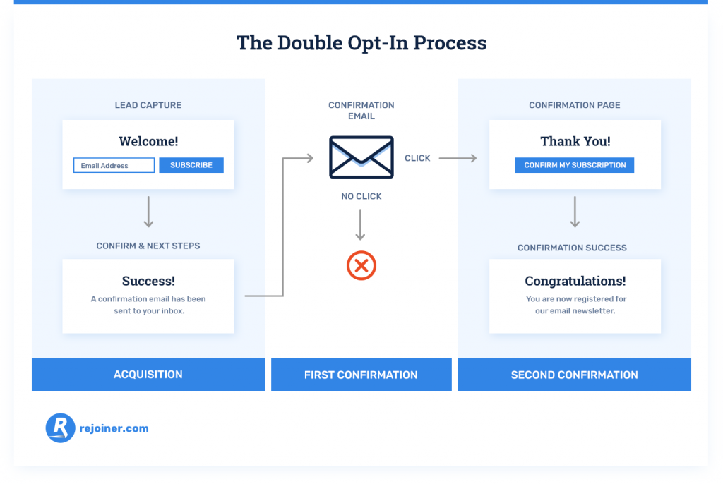
Double opt-in vs. single opt-in: Double opt-in means new subscribers receive a confirmation email asking them to verify their email address before they are added to your list. Single opt-in adds them immediately without verification.
Double opt-in produces a higher-quality, more engaged list — because only people who genuinely want to be there will go through the extra step of confirming. It also protects you from fake email addresses and reduces spam complaints. The trade-off is that some people do not complete the confirmation step, resulting in a slightly smaller list.
For most businesses building serious email lists, double opt-in is recommended.
Success message: Configure what happens after someone submits the form. You can show a success message on the same page (“You are in! Check your inbox for your free template.”) or redirect them to a dedicated thank-you page.
A dedicated thank-you page is generally better — it gives you a clean URL to track as a conversion in Google Analytics, allows you to provide more detailed next steps for your new subscriber, and can be used to offer an additional resource or action (like following you on social media or reading a specific blog post).
Step 9 — Connect the Form to Your Group and Automation
In your form settings, confirm that form submissions are added to the correct subscriber group — the group you created in Step 5. And confirm that the automation you set up in Step 6 is triggered by new subscribers joining that group.
This connection is what makes the whole system work automatically — someone submits your form, they are added to your group, the group triggers your automation, and your automation sends them the welcome email with the lead magnet. All within seconds, completely without manual intervention.

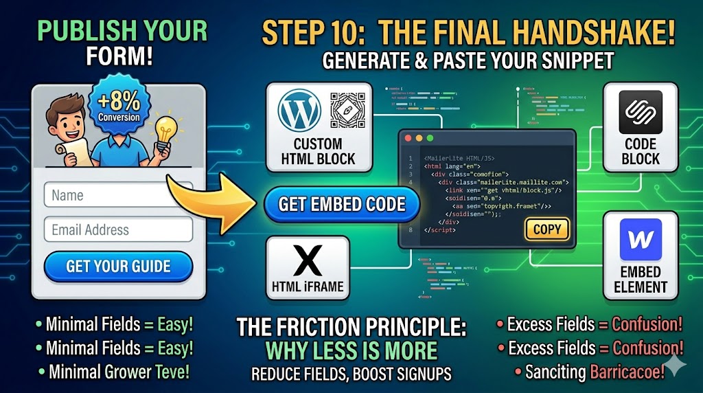
Step 10 — Get Your Embed Code
Once your form is configured, styled, and connected — generate the embed code. MailerLite provides a simple HTML snippet that you copy and paste into your website wherever you want the form to appear.
If you use WordPress, you can paste this HTML snippet directly into a Custom HTML block in the Gutenberg editor, or use a plugin like Insert Headers and Footers to add it in specific locations. If you use Squarespace, paste it into a Code Block. If you use Wix, add an HTML iFrame element. If you use Webflow, use an Embed element.
Most email marketing platforms also provide WordPress plugins or direct integrations that make embedding even simpler — check your platform’s documentation for the easiest method for your specific website setup.
Part Four — Where to Place Your Signup Form
Building a great form is only half the battle. Where you place it on your website determines how many people actually see and complete it.
Placement 1 — Above the Fold on the Homepage
The area visible on a webpage before scrolling — called “above the fold” — is the highest-visibility real estate on any page. A signup form or a prominent call to action leading to a signup form placed here will be seen by virtually every homepage visitor.
This placement works best when your homepage’s primary goal is list building — for example, if you run a newsletter-focused business or a lead generation website. A large, prominent form with a compelling headline and strong lead magnet offer can make list building the centerpiece of your homepage experience.
Placement 2 — End of Blog Posts
Someone who has just finished reading one of your blog posts has just invested several minutes in your content. They found it valuable enough to read to the end. This is one of the highest-intent moments in any website visit — and a perfectly contextual moment to offer a related lead magnet.
A signup form at the end of each blog post — offering a resource that expands on the topic just covered — consistently converts well because the context is perfectly aligned. The visitor just read about Instagram marketing? Offer them your free Instagram content calendar. They just read about tax planning? Offer them your personal finance checklist.
This contextual alignment between the content and the lead magnet is what makes end-of-post forms so effective. Tailor the form and offer to the specific content of each blog category rather than using one generic form everywhere.
Placement 3 — The Sidebar
A signup form in the sidebar of your blog or content pages is a classic placement that keeps the form visible throughout the reading experience without interrupting it. The sidebar is particularly effective on desktop — on mobile, sidebars typically collapse below the content, reducing their visibility.
Placement 4 — Dedicated Landing Page
A landing page is a standalone page on your website with a single purpose — getting visitors to sign up. It has no navigation, no distractions, no other calls to action. Just your headline, your lead magnet description, your form, and a submit button.
Landing pages typically convert at significantly higher rates than embedded forms on content pages because they have no competing elements. They are ideal for driving traffic through paid advertising, social media links in bio, or any promotion where you want complete control over the experience.
Every lead magnet you create deserves its own dedicated landing page. When you mention your lead magnet on social media, in a podcast interview, in a guest blog post — you link to this page.
Placement 5 — Popup Forms
Popup forms appear as an overlay on top of your page content, demanding attention in a way that embedded forms cannot. When used thoughtfully, they are highly effective. When used badly, they are deeply annoying and drive visitors away.
The key to effective popups is timing and targeting. A popup that appears the moment someone lands on your homepage is intrusive and irrelevant — they have not had any time to determine whether they are interested in what you offer. A popup that appears after someone has been on your page for sixty seconds, or after they have scrolled 60% of the way down a blog post, or as they are about to leave the page (exit-intent popup) — these are far more contextual and less intrusive.
Exit-intent popups deserve special mention. These are popups that detect when a visitor’s mouse is moving toward the browser’s close button or navigation bar — signaling they are about to leave — and display the popup at that moment. Because the visitor was leaving anyway, there is no experience to interrupt. Exit-intent popups consistently achieve high conversion rates precisely because they appear at the moment of maximum potential.
Configure your popups to appear no more than once per visitor per session — someone who dismisses your popup should not see it again immediately. Respect the visitor’s choice to dismiss.
Placement 6 — The Footer
The footer is the least high-intent placement — visitors who scroll all the way to the bottom of your page without signing up anywhere else are unlikely to sign up there. But a footer signup form serves as a final catch-all option and ensures that some form of signup opportunity is available everywhere on your site, no matter what page a visitor lands on.
Placement 7 — Inline Within Content
Embedding a signup form or a text-based call to action inline within your blog post content — not just at the end, but two-thirds of the way through a long post, for example — captures readers at a moment of high engagement. Some readers will be so engaged by your content that they want to sign up before they even finish reading.
The best practice is to have at least two to three signup touchpoints on any piece of long-form content — one inline within the content, one at the end of the post, and one in the sidebar (on desktop).
Part Five — Optimizing Your Signup Form Over Time
Creating your signup form is not a one-time task — it is the beginning of an ongoing optimization process. Small improvements in your form’s conversion rate compound dramatically over time.
Step 11 — Track Your Form’s Performance
Most email marketing platforms show you your form’s conversion rate — the percentage of people who see the form and complete it. This is your baseline metric.
A form that is converting below 1% is underperforming and warrants immediate attention. Between 1% and 3% is average for a generic newsletter signup. Between 3% and 8% is strong for a well-optimized form with a relevant lead magnet. Above 8% is excellent and usually indicates a highly specific, highly valuable lead magnet combined with strong form copy and placement.
Set up Google Analytics on your website and configure goal tracking for your thank-you page URL — this lets you see exactly how many conversions your form generates each month, where those conversions are coming from, and which traffic sources bring the most likely signups.
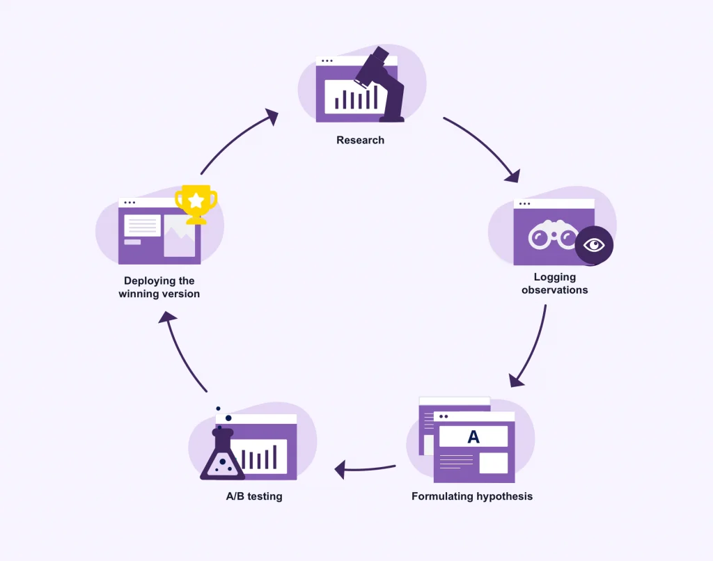
Step 12 — A/B Test Your Key Elements
A/B testing — showing different versions of your form to different visitors and comparing which performs better — is the most reliable way to improve your conversion rate based on evidence rather than guesswork.
The most impactful elements to test are your headline (the single biggest driver of conversion rate), your button text, your lead magnet offer itself, the number of fields, and your form’s visual design and positioning.
Test one element at a time. If you change your headline and your button text simultaneously and your conversion rate improves, you will not know which change drove the improvement. Isolate variables.
Most email marketing platforms have built-in A/B testing for forms. Run each test for long enough to reach statistical significance — typically at least 200-300 form views per variant before drawing conclusions.
Step 13 — Review and Refresh Your Lead Magnet
Your lead magnet is the single biggest driver of your form’s conversion rate. And lead magnets have shelf lives — what felt fresh and valuable two years ago might feel dated or generic today.
Review your lead magnets annually. Are they still relevant? Has your industry changed in ways that make them outdated? Are competitors now offering similar things, reducing your differentiation? Would a different format — a video course instead of a PDF, an interactive tool instead of a checklist — be more appealing to your current audience?
Do not hesitate to retire underperforming lead magnets and replace them with better ones. Your list growth will reflect the quality of your offer.
Common Signup Form Mistakes to Avoid
Even with the best intentions, certain mistakes consistently undermine signup form performance. Here are the most common ones.
Asking for too much information. Every additional field reduces conversion rate. If you do not have a specific, immediate use for a piece of data — do not collect it.
Using “Subscribe to Our Newsletter” as your headline. This is the most generic, uninspiring signup prompt possible. Replace it with a specific, benefit-driven headline that communicates exactly what the visitor will get.
No lead magnet. Asking people to sign up for “updates” with nothing specific in return is an uphill battle. Always offer something of genuine value.
Burying the form where nobody sees it. A form in your footer and nowhere else will generate almost no signups. Place your form in multiple high-visibility, high-intent locations.
Not testing on mobile. A significant portion of your visitors are on mobile devices. A form that looks great on desktop but is broken, tiny, or confusing on mobile is losing a huge portion of potential signups. Always test your form on multiple screen sizes before publishing.
Forgetting the privacy note. A brief privacy assurance beneath your submit button reduces submission anxiety and builds trust. Always include it.
Not delivering the lead magnet promptly. If someone signs up for your free guide and receives it three days later with no communication in between, you have already damaged the relationship. Your automation should deliver the lead magnet within seconds of signup.
Never following up. A single welcome email and then silence is not email marketing — it is just collecting addresses. Plan a welcome sequence of three to five emails that introduces you, delivers value, and gradually moves new subscribers toward the next step in your relationship.
Making the thank-you experience forgettable. The moment after signup is a high-engagement moment — the subscriber is excited about what they are going to receive. Use your thank-you page to deepen that relationship — point them to your best content, invite them to follow you on social media, or offer an additional resource.
Legal Considerations — What You Need to Know
Collecting email addresses comes with legal responsibilities that vary by country and region. Here is a brief overview of the most important considerations.
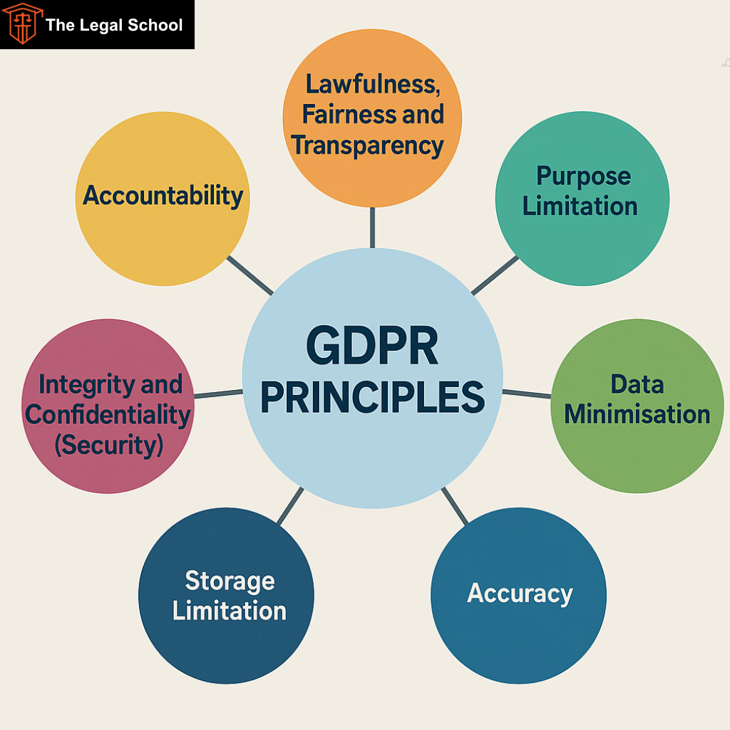
GDPR (General Data Protection Regulation) — applies to anyone collecting data from European Union residents. Key requirements include clear, explicit consent (your form must clearly explain what you will use their email for), easy unsubscribe options in every email, the ability for subscribers to request deletion of their data, and a clear privacy policy.
India’s Digital Personal Data Protection Act (DPDP Act) — India’s comprehensive data privacy legislation that came into effect in 2023. It requires clear notice to users about data collection and usage, explicit consent before processing personal data, reasonable security safeguards for collected data, and processes for data deletion requests.
CAN-SPAM Act — applies to commercial emails sent to US recipients. Key requirements include a clear identification of your emails as commercial communication, a valid physical address in every email, clear opt-out mechanisms, and prompt processing of unsubscribe requests.
Best practices that satisfy most regulations: Use double opt-in to ensure clear consent, include a link to your privacy policy near your signup form, include an unsubscribe link in every email you send, use a reputable email marketing platform that handles compliance infrastructure, and never add people to your list without their explicit consent.
When in doubt, consult a legal professional familiar with data privacy law in your jurisdiction. The consequences of non-compliance can be significant.
Your Signup Form Launch Checklist
Before your form goes live, run through this checklist.
Your goal for the form is clearly defined. You have a compelling, specific lead magnet to offer. You have chosen the right email marketing platform and set up your account. You have created a subscriber group for this form. You have set up an automation to deliver the lead magnet automatically. Your form has the minimum necessary fields — name and email. Your headline is specific, benefit-driven, and compelling. Your submit button has action-oriented text. Your form design matches your website’s visual identity. You have added a privacy note below the submit button. You have configured a thank-you page or success message. You have set up double opt-in for list quality. You have tested the form on both desktop and mobile. You have verified that the lead magnet delivery automation works correctly by testing with your own email. You have placed the form in at least two or three strategic locations on your website. You have configured conversion tracking in Google Analytics.
Every box checked? Your form is ready to go live.
Final Thoughts — The Form Is the Beginning, Not the End
A signup form is not a goal in itself. It is the beginning of something — a relationship between you and the people who visit your website and choose to raise their hand and say “yes, I want to hear from you.”
What you do with those email addresses after they come in — how you welcome new subscribers, how consistently you show up in their inbox, how much value you deliver before you ever ask for anything in return — that is what determines whether your email list becomes a genuine business asset or just a growing list of unengaged addresses.
Build the form. Make it beautiful and compelling and easy to complete. Place it everywhere it makes sense. Drive traffic to it. Optimize it relentlessly.
And then — show up for the people who trusted you enough to sign up. Send emails worth reading. Deliver on the promise your lead magnet made. Build a real relationship.
Because in the end, email marketing is not about forms and platforms and automation sequences. It is about people. Real people who found your website, found it valuable, and chose to invite you into their inbox.
Honor that choice. And everything else will follow.
Written by Digital Drolia | Helping you build a digital presence that converts — one smart system at a time.