![]()


Why the YouTube Thumbnail is the First Advertisement for Your Video
Let me take you inside a decision that happens in less than one second.
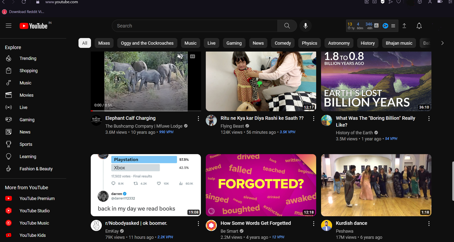
You open YouTube. Maybe you searched for something specific — “how to negotiate a salary hike” or “best places to visit in Coorg in monsoon.” Maybe you are on the homepage, looking at what the algorithm has surfaced for you. Either way, you are presented with a grid of video options. Thumbnails and titles, arranged in rows.
Your eyes move across the grid. You are not reading. You are scanning. Your visual system is processing dozens of images simultaneously, running each one through a rapid, mostly unconscious assessment. Does this look interesting? Does this look like it will answer my question? Does this look like something made by someone who knows what they are talking about? Does this look like it is worth the next ten minutes of my life?
Within approximately half a second — faster than conscious thought, faster than language — you have already pre-filtered the grid. Some thumbnails have already registered as possibilities. Most have already been discarded without your being consciously aware of discarding them.
Then you look more carefully at the possibilities. You might read the title. You might glance at the channel name, the view count, the upload date. And then you click — or you do not.
The thumbnail was the first filter. In most cases it was the decisive filter. The video you clicked on survived that half-second assessment. The videos you did not click on failed it.
This is the most important moment in the life of any YouTube video. Not the first five seconds — we covered that in our post on video intros. Not the quality of the content. Not the editing. Not even the title, though the title matters enormously.
The thumbnail.
Because if the thumbnail does not survive the half-second assessment — if it does not pass through the viewer’s unconscious visual filter as a possibility worth considering — the viewer never reaches the title, never reads the description, never encounters the first five seconds.
The thumbnail is the first advertisement for your video. It is also, in many cases, the only advertisement that gets evaluated. And most creators treat it as an afterthought.
The Numbers That Make the Stakes Clear
Before we go deeper into what thumbnails do and how to make them well, the numbers deserve a moment of attention. Because the scale of what is at stake is not intuitive until you see it clearly.
YouTube’s own internal data — shared through their Creator Academy and in various public statements from the company — consistently shows that the click-through rate of a video is one of the most significant factors in how the algorithm determines its distribution. Videos with higher click-through rates are shown to more people. Videos with lower click-through rates are shown to fewer people, regardless of the quality of the content within them.
Click-through rate is the percentage of people who, having seen a video’s thumbnail and title in search results or on their feed, actually click through to watch the video. Industry benchmarks suggest that a click-through rate of two to ten percent is typical across YouTube, with the best-performing videos achieving significantly higher.
The difference between a two percent click-through rate and a six percent click-through rate — a threefold improvement — means that for every thousand times the video is shown, sixty people watch it instead of twenty. The algorithm, seeing that more people are choosing this video when shown it, shows it to more people. Compounded across weeks and months, a relatively small improvement in click-through rate produces dramatically different outcomes in total reach and audience growth.
And what drives click-through rate more than any other single element? The thumbnail.
YouTube’s own research has found that viewers are more likely to click on a video based on the thumbnail than based on the title. In the scanning behaviour that characterises how people browse YouTube, the image is processed before the text. If the image does not arrest the eye, the text is never read.
This means that the thumbnail is not just an afterthought to the content — it is the primary driver of whether the content gets watched at all.
What a Thumbnail Actually Is — Beyond the Obvious Definition
A thumbnail is a still image — typically 1280 by 720 pixels, in JPEG or PNG format — that represents a video in YouTube search results, on the homepage, in the suggested videos section, and in shared links on other platforms.
You can use an auto-generated thumbnail — a screenshot that YouTube automatically captures from your video at a random moment. Most serious creators do not do this, for reasons that will become obvious.
You can create a custom thumbnail — a purpose-designed image that you upload separately from the video. This is what every creator who understands the stakes does.
The custom thumbnail is where the opportunity lies. Because a purpose-designed image can do things that a random screenshot from the video almost never can.
It can feature a specific expression or pose that was never in the footage. It can include text overlays that communicate information or create curiosity. It can use graphic design elements — colours, shapes, borders, contrast — that make it visually distinct from competing thumbnails in the same search results. It can be designed with the thumbnail format specifically in mind — with elements that work at both large sizes and small, on both desktop and mobile. It can be A/B tested against alternative versions to find what generates the highest click-through rate with a specific audience.
The custom thumbnail is a designed communication object — and like all designed communication objects, its quality is determined by the quality of the thinking and craft that went into making it.
The Psychology of Visual Attention — What Thumbnails Need to Do in Half a Second
The half-second assessment that thumbnails must survive is not arbitrary or capricious. It follows patterns that are deeply grounded in human visual psychology — patterns that experienced designers and creators have learned to work with.
Understanding these patterns is the foundation of making thumbnails that work.
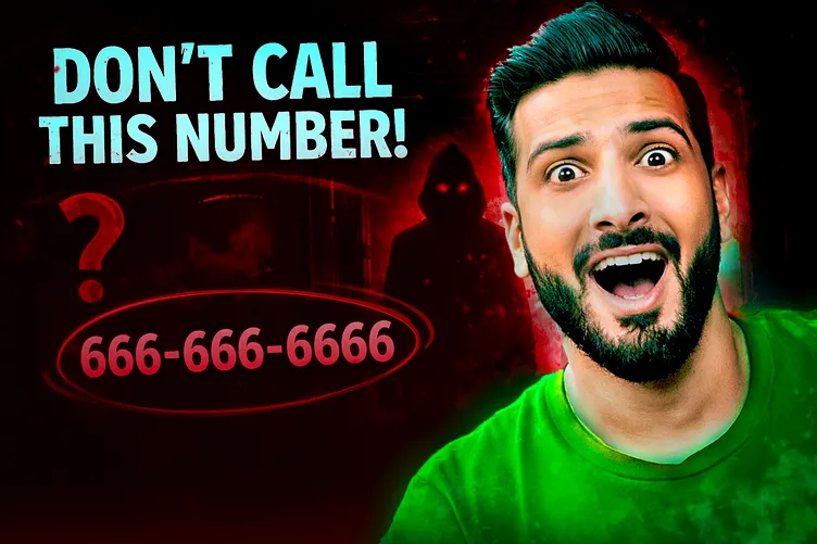
Pattern One: Faces and eyes command attention before anything else
The human visual system has a dedicated neural pathway — sometimes called the face detection system — that identifies faces in any visual field faster than it identifies any other type of image. This is not cultural. It is biological. We evolved in a social environment where reading other faces — for threat, for emotion, for intention — was critical to survival. The face detection system operates automatically and pre-consciously.
When a thumbnail contains a human face, the viewer’s eyes go to the face first. Always. Regardless of what other elements are in the image.
And within the face, the eyes are the most powerful attractor. A face looking directly into the camera creates an instant social engagement — the brain perceives it as a direct address, as eye contact, as a person speaking specifically to the viewer. A face looking at something off-frame creates curiosity — the brain wants to know what the person is looking at.
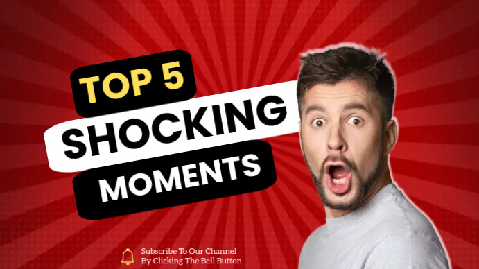
This is why the most effective YouTube thumbnails almost always feature a face — typically the creator’s face, with a clear and strong expression. Not a neutral expression. Not a polite smile. A specific, strong expression that communicates an emotion — surprise, excitement, concern, delight, scepticism — that is relevant to the video’s content and that creates an immediate emotional connection with the viewer.
Pattern Two: Contrast and colour create visual hierarchy
In a grid of thumbnails, each competing for attention, the images that stand out are those with high internal contrast — bright against dark, saturated against neutral — and distinctive colour choices that differentiate them from their neighbours.
Human visual attention is drawn to high-contrast areas within a scene. An image where the main subject pops sharply against the background — where there is clear visual separation between foreground and background — is processed more quickly and easily than an image where everything blurs into similar tonal values.
Colour also plays a role in standing out. If the three competing thumbnails in a search result all use blue as their dominant colour — a common choice because blue communicates trust — the thumbnail that uses orange or red will stand out through simple colour contrast with its neighbours.
This does not mean thumbnails should be aggressively garish or visually overwhelming. It means that the design choices should ensure the most important elements — the face, the text, the key visual — are immediately visible and clearly separated from everything else.
Pattern Three: Legibility at small size is non-negotiable
YouTube thumbnails are displayed at many different sizes across different surfaces and devices. On a desktop browser, they may be shown at a relatively large size in search results. On a mobile phone, they may be tiny — small enough that fine details become invisible.
A thumbnail that looks great at full size but becomes illegible at small size — where the text is too small to read, the face too small to recognise, the key visual too compressed to understand — fails half its potential audience.
The test for any thumbnail is simple: reduce it to approximately 120 by 67 pixels — the smallest size at which it typically appears — and ask whether the essential communication still works. Does the face still read? Does the text, if any, still register as present? Does the overall visual impression still communicate what the thumbnail is meant to communicate?
If it does not pass this small-size test, it needs to be simplified.
Pattern Four: Text on thumbnails should be minimal and massive
Many effective YouTube thumbnails include text — a few words that add critical context, create curiosity, or communicate the specific angle of the video. But the most common mistake with thumbnail text is the same as the most common mistake with text in video: there is too much of it.
Thumbnail text works when it is three to five words maximum, displayed at a font size that is immediately readable at small thumbnail sizes, with high contrast against the background — typically either very light text on a dark background or very dark text on a light background.
Text that requires effort to read — because the font is too small, the contrast too low, or the words too numerous — is text that does not get read. And text that does not get read is not serving the thumbnail’s communication purpose. It is just visual noise that makes the thumbnail busier and harder to process.
The discipline of thumbnail text is ruthless brevity combined with maximum legibility. If you cannot say what you need to say in five words or fewer, in a font large enough to read at small size, with contrast high enough to be immediately visible — say it differently or do not say it in the thumbnail at all.
The Three Questions Every Thumbnail Must Answer


When a viewer scans a thumbnail in their half-second assessment, their visual system is implicitly asking three questions. A thumbnail that answers all three clearly generates clicks. A thumbnail that fails to answer any of them loses the viewer before the title has even been read.
Question One: What is this about?
The thumbnail must communicate the subject of the video clearly enough that the viewer can immediately categorise it. Not in detail — they do not need to understand the entire content in half a second. But they need to know: is this a cooking video? A tech review? A travel vlog? A finance tutorial? A fitness routine?
If the viewer cannot categorise the video from the thumbnail — if it is visually ambiguous, could be almost anything — their unconscious assessment marks it as uncertain and it gets filtered out. Uncertainty is cognitive cost. The viewer moves to a thumbnail that is immediately clear about what it offers.
Question Two: Is this relevant to me right now?
This is the most important question in search contexts — where the viewer has come with a specific intent. A viewer who has searched “how to negotiate a salary hike” is scanning the results for thumbnails that clearly signal relevance to salary negotiation. A thumbnail of a person looking confident with text saying “SALARY NEGOTIATION” signals relevance immediately. A thumbnail that is visually ambiguous about its subject requires the viewer to work harder to assess relevance — and many will not make that effort.
In discovery contexts — the homepage, suggested videos — the relevance question shifts slightly. The viewer is not looking for a specific answer; they are open to being interested by something they were not expecting. Here the relevant question becomes: does this look interesting enough to warrant clicking even though I was not looking for it?
Question Three: Can I trust this creator?
This is the credibility question — and it is often the most underappreciated of the three. A viewer who is about to invest ten or twenty minutes of their time wants some signal that the creator is worth that investment.
A thumbnail communicates credibility through production quality — does it look designed and intentional, or does it look like a screenshot from a bad Zoom call? Through the creator’s expression and body language — does this person look confident and knowledgeable, or uncertain and amateur? Through visual consistency with other thumbnails — if the viewer has seen this creator’s content before, consistent thumbnail design signals a professional and organised approach.
A thumbnail that looks low-effort, poorly composed, or visually chaotic communicates — regardless of the actual quality of the video within — that the creator has not taken care with their presentation. And if they have not taken care with the presentation, why should the viewer trust the content?
Anatomy of a High-Performing Thumbnail — The Elements That Work
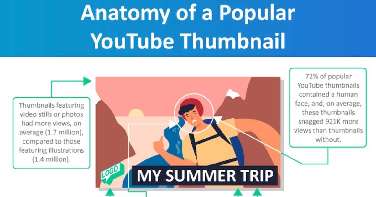
Looking across the highest-performing YouTube channels in different categories — finance, cooking, travel, education, technology, lifestyle — certain thumbnail design patterns appear with remarkable consistency. These patterns are not coincidences. They are the result of the collective learning of thousands of creators who have tested, observed, and iterated toward what actually generates clicks.
The dominant face
High-performing thumbnails in most categories feature the creator’s face prominently — typically large enough that the expression is clearly readable even at small thumbnail sizes. The face is usually positioned to one side of the thumbnail rather than centred, creating space on the other side for text or a secondary visual element.
The expression is specific and strong. The face conveys a specific emotion — curiosity, shock, delight, seriousness, excitement — that is relevant to the video’s content. The expression is often more exaggerated than what the creator actually displays in the video — because the thumbnail needs to communicate emotion clearly at small size and in competition with other visuals.
The text overlay
Many of the most effective thumbnails include three to five words of text that add the information the image alone cannot convey. The image might show a face expressing shock — but shock about what? The text provides the context: “THEY CHANGED EVERYTHING” or “THIS ACTUALLY WORKED” or “NEVER DO THIS.”
The text overlay typically uses a bold, high-contrast font. It is large — often taking up twenty to thirty percent of the thumbnail’s vertical space. It is positioned so that it does not obscure the face’s eyes — because the eyes must remain visible to maintain the face’s attentional pull.
The text often creates curiosity rather than completing information — it gives enough context to understand the topic but withholds enough to make the viewer want to know more. “I TRIED THIS FOR 30 DAYS” tells the viewer the video is about a personal experiment lasting thirty days. It does not tell them the result — which they need to click to find out.
The visual contrast and colour
The thumbnail uses high internal contrast — the face or key visual stands out clearly from the background. The background may be a solid colour, a blurred version of the video’s setting, or a simple graphic element. The key is that the foreground elements are clearly separated from the background.
The colour palette is intentional — using colours that are distinctive within the category’s typical colour environment. A finance creator who notices that most competing thumbnails use blue and gold might choose to use high-contrast black and white as their signature palette, standing out through differentiation rather than similarity.
The composition
The thumbnail is composed with the knowledge that important elements — the face, the key text — should be positioned in the areas of the frame that the viewer’s eye naturally visits first. In most Western and South Asian reading contexts, the eye moves from left to right and from top to bottom. Placing the most important element in the left-centre or top-left portion of the thumbnail gives it the best chance of being the first element processed.
Thumbnail Mistakes That Cost Creators Viewers Every Day

The mistakes that keep thumbnails from performing fall into predictable patterns. Knowing what they are is as important as knowing what to do right.
The auto-generated screenshot
Using YouTube’s automatically generated thumbnail — a random frame from the video, often showing the creator mid-blink, in a transitional expression, with poor lighting — is the most fundamental and most costly thumbnail mistake a creator can make.
Auto-generated thumbnails communicate one thing above all else: the creator did not think the thumbnail was worth their time. This is both a missed opportunity and a credibility signal — and the credibility signal it sends is not good.
Every video deserves a custom thumbnail. No exceptions.
The cluttered thumbnail
Trying to include too much — multiple faces, multiple text elements, multiple visual themes, complex backgrounds — produces a thumbnail that is visually overwhelming and communicates nothing clearly. The viewer’s eye does not know where to go. The image fails the half-second test because no single element is dominant enough to anchor the assessment.
The discipline of thumbnail design is elimination. Start with all the elements you might want to include and then remove everything that is not essential to the one core communication the thumbnail needs to make. What remains should be simple, dominant, and immediately clear.
The text that cannot be read
Small fonts, low-contrast text, text placed over complex backgrounds that make the letters difficult to distinguish — all of these produce text that technically exists in the thumbnail but functionally does not, because it cannot be read quickly enough to contribute to the half-second assessment.
If the text in your thumbnail cannot be read clearly at the size of a postage stamp, it is doing more harm than good. Either enlarge it, increase its contrast, or remove it.
The thumbnail that does not match the video
A common and seriously damaging mistake is creating a thumbnail that is visually compelling but does not accurately represent the video’s content — using a dramatic expression or a dramatic text overlay that promises something the video does not deliver.
This practice — sometimes called clickbait — generates high click-through rates in the short term but produces low watch time, high abandonment rates, and audience trust destruction. YouTube’s algorithm measures viewer satisfaction, not just click-through rate. A video that gets clicked often but abandoned quickly tells the algorithm that the thumbnail is misleading and receives progressively less distribution.
The thumbnail must honestly represent the video’s value. It should be designed to attract the right viewers — the ones who will watch and be satisfied — not to trick the wrong viewers into clicking and leaving immediately.
The thumbnail that looks like every other thumbnail in the category
There is a paradox in thumbnail design: the safest-looking thumbnail — the most genre-conventional, the one that most closely follows the established patterns of similar content — is often the least effective because it provides no differentiation in a search result where it appears alongside similar thumbnails.
If you search “personal finance tips” on YouTube and every thumbnail shows a serious-looking person against a blue background with yellow text, the thumbnail that will stand out is the one that breaks that pattern meaningfully — not randomly, but with intention.
Studying the thumbnail conventions of your genre and then finding ways to be recognisably part of that genre while visually distinct from its conventions is one of the higher-order thumbnail design skills — and one of the most powerful competitive advantages available.
Creating Your Thumbnail in Filmora — The Practical Workflow
For creators using Filmora as their editing platform, thumbnail creation is a natural extension of the video editing workflow. Filmora’s export capabilities allow you to extract specific frames from the video to use as thumbnail bases — letting you identify the moment in the footage where your expression and body language are exactly right, and using that as the foundation for your custom thumbnail.
Once you have identified the frame — or decided to photograph a specific thumbnail image separately, which many professional creators do — the thumbnail design itself can be completed in Filmora’s graphic design tools or in complementary tools like Canva, which many YouTube creators use specifically for thumbnail creation.
The practical process:
Identify the frame from your video with the best expression, lighting, and positioning for the thumbnail. Export it at full resolution.
Bring the frame into your design tool. Remove or replace the background if needed — a clean or blurred background usually reads better than a complex real-world background at small sizes.
Add your text overlay. Use a bold font, choose your two or three words carefully, ensure maximum contrast with the background, and check the readability at reduced size.
Add any graphic design elements — borders, shapes, icons, or other visual elements that are part of your channel’s thumbnail identity.
Check the complete thumbnail at three sizes: full size, half size, and thumbnail size. Make sure the essential communication — the expression, the text — remains clear at all three.
Export at 1280 by 720 pixels in JPEG format. Upload as the custom thumbnail when publishing your video.
The A/B Testing Dimension — How to Know if Your Thumbnail is Working
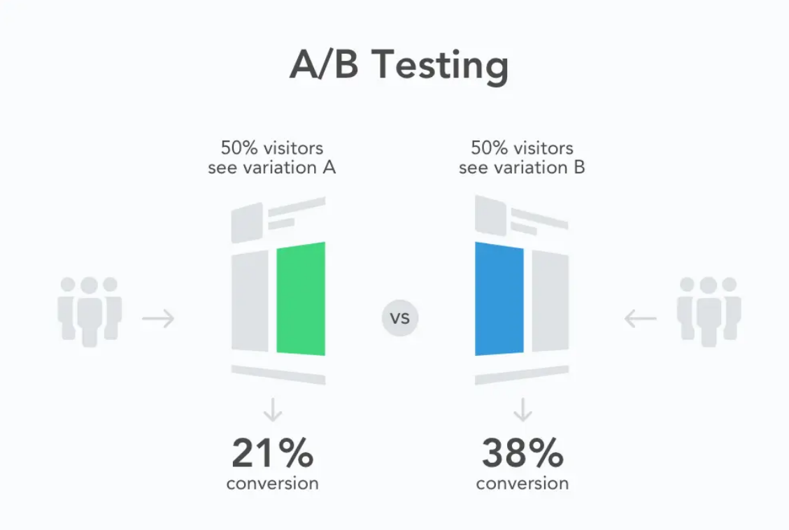
Creating a good thumbnail is an iterative process. Even experienced creators do not always know which of several thumbnail options will perform best with their specific audience. The only way to know is to test.
YouTube provides a feature — available to channels enrolled in the YouTube Partner Programme — called Thumbnail A/B Testing, which allows creators to test two different thumbnails for the same video and measure which generates higher click-through rates. The platform automatically serves each version to different viewer groups and collects data on which generates more clicks.
For creators who do not yet have access to this feature, informal testing is possible by changing the thumbnail of an existing video and monitoring whether the click-through rate improves. The metrics are visible in YouTube Studio — click-through rate is one of the key metrics displayed in the analytics for each video.
What to test: the fundamental variables that most affect click-through rate are expression (different emotional registers on the face), text (different words or no text versus text), and background (different colour palettes or visual environments). Test one variable at a time to understand which change drives the improvement.
What to measure: click-through rate is the primary metric, but watch it in the context of impressions — the number of times the thumbnail was shown. A thumbnail that generates a higher click-through rate on a hundred impressions may not be meaningful. A thumbnail that generates a consistently higher click-through rate on ten thousand impressions is a meaningful signal.
What to learn: every test is not just a practical improvement to a specific video. It is information about your audience — about what visual signals they respond to, what emotional cues motivate them, what level of text they find useful versus cluttered. This knowledge accumulates and improves your thumbnail creation judgment over time.
The Thumbnail as Brand — Consistency Across a Channel

For creators who are building a channel with serious long-term intent, the thumbnail is not just the first advertisement for a single video. Over time, it becomes a building block of channel brand recognition.
Think about the YouTube channels you have watched extensively and whose thumbnails you would recognise immediately in a search result, before reading the title or seeing the channel name. The red border that certain channels use. The specific typography that another creator has made their signature. The colour palette that a third creator applies consistently.
This recognition is earned through consistency — through the patient, deliberate application of a consistent visual identity across many videos over time. When a viewer has watched ten of a creator’s videos and encountered the same thumbnail style each time, the thumbnail style itself becomes a signal. It communicates: this is from the creator I trust on this topic. The visual recognition precedes and reinforces the content credibility.
Building a consistent thumbnail style involves defining and maintaining a small set of visual elements across all thumbnails: a consistent font, a consistent colour palette, a consistent position for the face, a consistent treatment of the text overlay. Not identical thumbnails — each video has its own subject and expression — but immediately recognisable thumbnails from the same visual family.
This brand consistency compounds over time. A viewer who encounters the channel’s thumbnail in a search result — even a new video they have not seen before — immediately recognises it as content from a trusted source. The thumbnail’s job is half done before the viewer has even consciously registered what video it represents.
This is one of the most significant competitive advantages that consistent, professional thumbnail design creates. It turns every new video into a reference to the channel’s entire body of credible, valued content.
The Thumbnail Beyond YouTube — Where Else It Matters
The thumbnail’s function extends beyond YouTube’s own platform. When a YouTube video is shared — on WhatsApp, on Twitter, on LinkedIn, embedded in a blog post, linked from a newsletter — the thumbnail is the visual representation of that link.
A WhatsApp forward with a compelling thumbnail creates curiosity and gets opened. A WhatsApp forward with a blurry auto-generated screenshot gets scrolled past. The thumbnail is performing its click-generating function not just within YouTube but across every platform where the video link appears.
This means the thumbnail’s design needs to work not just within the context of YouTube’s search results — surrounded by other YouTube thumbnails — but also as a standalone image in the context of a WhatsApp chat, a Twitter feed, or an embedded website post. The visual communication needs to be clear and compelling in all of these contexts simultaneously.
In practice, this means the thumbnail should work without the YouTube interface around it — no channel name below, no view count beside it, no suggested videos competing for attention around it. Just the image, standing alone, making its case for why the viewer should click.
Thumbnails that pass this standalone test — that communicate clearly and compellingly as isolated images without any supporting context — tend to be the thumbnails that generate the highest sharing-driven traffic, which is some of the most valuable traffic a YouTube video can receive.
The Creator Who Changed Everything By Changing One Thing
Let me bring this back to the human level with a story that illustrates what the principles in this post actually mean in practice.
A personal finance creator named Divya had been posting on YouTube for fourteen months. Her content was genuinely useful — she covered topics like emergency funds, term insurance, and how to evaluate mutual funds for a first-time investor. The information was accurate and clearly explained. Her production quality was decent. She posted consistently.
Her average view count was between eight hundred and two thousand views per video.
She attended a creator meetup where a more established creator looked at her channel for five minutes and said: “Your thumbnails are invisible. They all look the same — blue background, white text, your face in the corner. There is nothing there to make someone stop scanning.”
Divya went home and pulled up her channel analytics. The average click-through rate across her videos was 1.8 percent — well below the platform average of two to five percent.
She spent a week studying the thumbnails of the top ten personal finance channels on YouTube. She noticed patterns she had not seen before. Larger faces, with genuine expressions. Text that created curiosity rather than just labelling the topic. Colour palettes that stood out in the finance category’s typical blue-and-gold environment.
She redesigned her thumbnail approach: larger face, stronger expression, bold text in high contrast, a distinctive warm orange palette that was different from every other finance creator she had studied.
She updated the thumbnails of her last fifteen videos with the new design.
Within three weeks, her average click-through rate had moved from 1.8 percent to 4.3 percent. YouTube’s algorithm, seeing that more people were clicking her videos when shown them, began showing them to more people. Two of her older videos, suddenly receiving more traffic through the algorithm, accumulated more views in three weeks than they had in the previous year.
Nothing about the videos themselves changed. The content was identical. The editing was the same. The information was unchanged.
The thumbnail had changed. Everything followed.
Closing Thought — The Billboard Nobody Can Ignore
There is a marketing principle — sometimes called the billboard test — that asks of any piece of communication: if someone had three seconds to encounter this message on a highway billboard while driving past, would they understand what it is offering and want to know more?
The YouTube thumbnail is the most precisely calibrated billboard in the history of advertising.
It is not on a highway where attention is divided between the road and the board. It is on a screen where the viewer’s entire attention is directed at the grid of options in front of them. It is not competing with real-world visual complexity — it is competing with other thumbnails, which makes the competition specific and analysable. It is not shown for three seconds — it is shown for as long as the viewer is scanning, which means it may be seen multiple times as the eye passes across the grid.
And unlike a highway billboard, the viewer can act on it immediately — one tap, one click, and the video begins.
The thumbnail is the first advertisement for your video. It is shown to more people than will ever watch the video. It is evaluated faster than any other element of your content. And it is, in the end, the thing that determines whether the rest of your work — the filming, the editing, the colour grading, the sound design, the intro hook, the music choices, all of it — ever gets experienced by the audience it was made for.
Design it accordingly.
Written by Digital Drolia — helping video creators understand that every element of their work, from the thumbnail outward, is a communication decision that shapes whether their audience finds them. Found this valuable? Share it with a creator who is spending hours on their content and minutes on their thumbnail.